
Good design is supposed to make our lives easier. Whether it’s a piece of furniture, a sign, or a kitchen gadget, the goal is usually to make things more practical and convenient. But sometimes, designers seem to forget that part of the job entirely. And instead of solving problems, their creations end up causing even more of them.
To show you what we mean, we’ve rounded up some hilarious design fails from a subreddit dedicated to spotting them. Scroll down to check them out, and don’t forget to upvote the worst offenders!
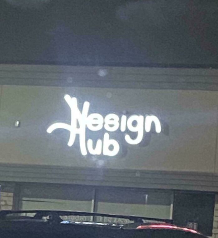
#1 The Logo Of A Store By My House
© Photo: nah328
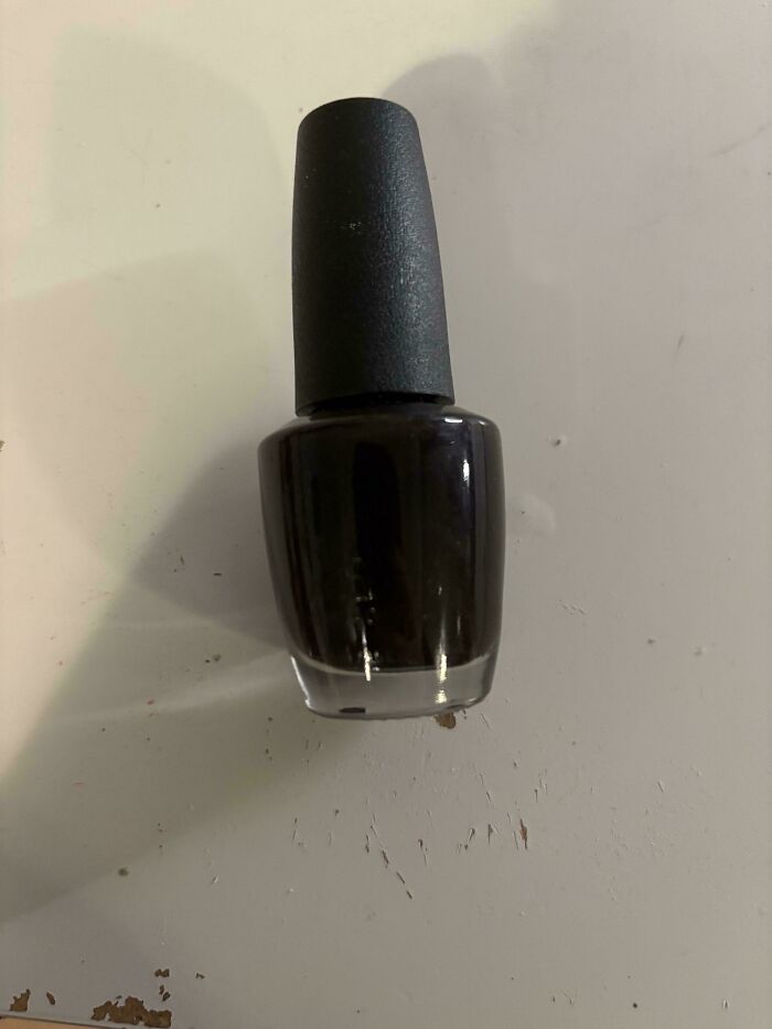
#2 How On Earth Am I Supposed To Read The Label On This Bottle. (Yes! There Is Actually A Label In The Picture!)
© Photo: Dark_Galaxyy
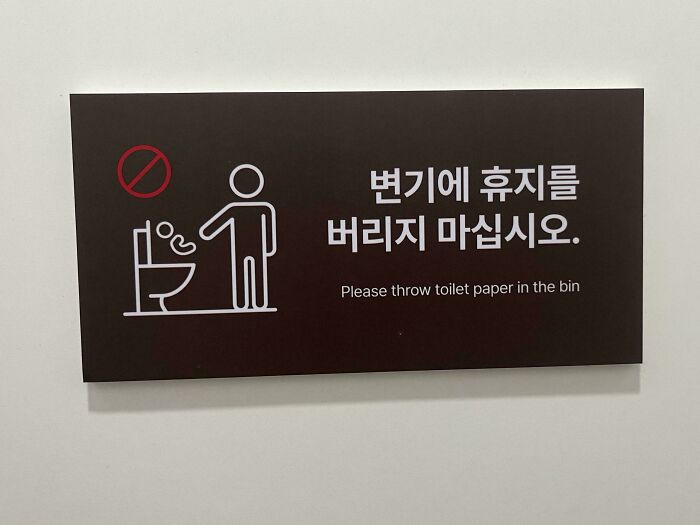
#3 … Toilet Paper?
© Photo: Glass_Commission_881
If you think about it, pretty much everything around us was designed by someone who had to make all sorts of decisions about how it should look and work.
The phone or computer you’re reading this on, for example. Someone decided how big the screen should be, where to put the buttons, and even what shape the letters you’re looking at right now should have.
The same goes for the bed you slept in last night or the chair you’re sitting on. There’s a surprising amount of thought behind things we barely even notice in our everyday lives.
#4 A Locking Drawer That Can Be Bypassed By Removing The Upper Drawers
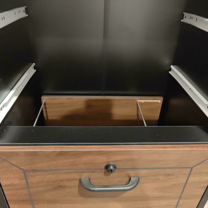
© Photo: GeneralAlexander
#5 Elevator 9 On Floor 14
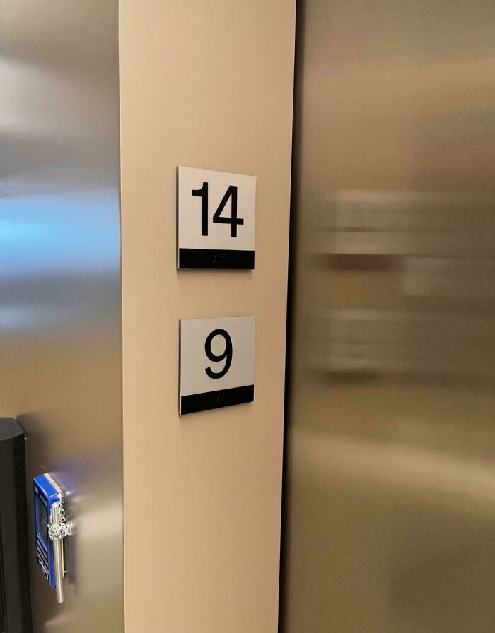
© Photo: Tokeee3
#6 Magnet Cant Lay Flat Bc Of The Curve
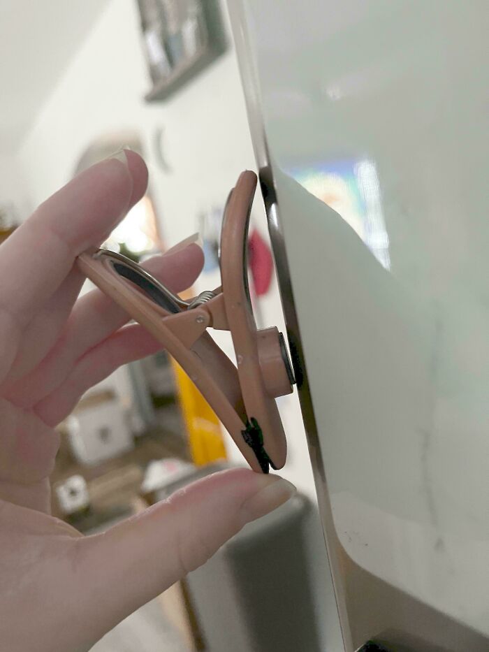
© Photo: turntech_ghosthead
Of course, some things are designed much better than others. We can usually tell when something works well, just as we can spot a bad design almost immediately.
In fact, a study by Gitte Lindgaard and her colleagues at Carleton University found that people can judge whether a website looks appealing in just 50 milliseconds, which is faster than the blink of an eye.
But explaining exactly what makes one design better than another can be surprisingly tricky. So, what do professional designers have to say about it?
#7 Stairs At My Psychologist, I Tripped And Almost Fell Face First When I Opened The Door The First Time
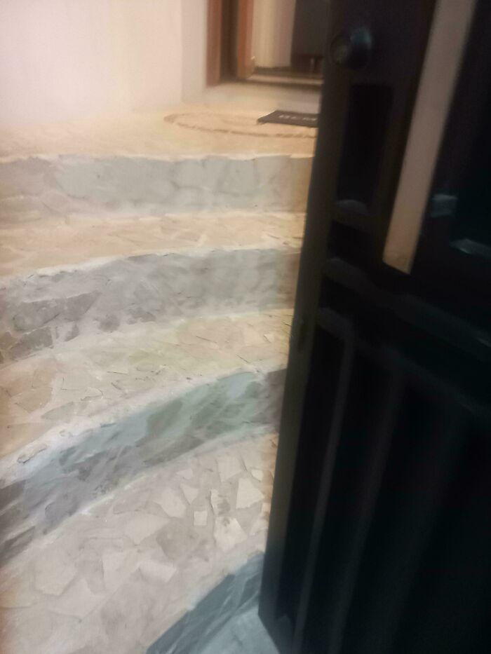
© Photo: Cryptid_Energy
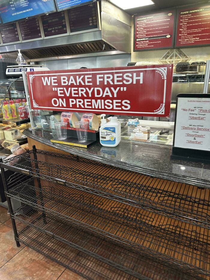
#8 The Quotes Make Me Doubt The Freshness Of Said Baked Goods…
© Photo: Senor_Diablo
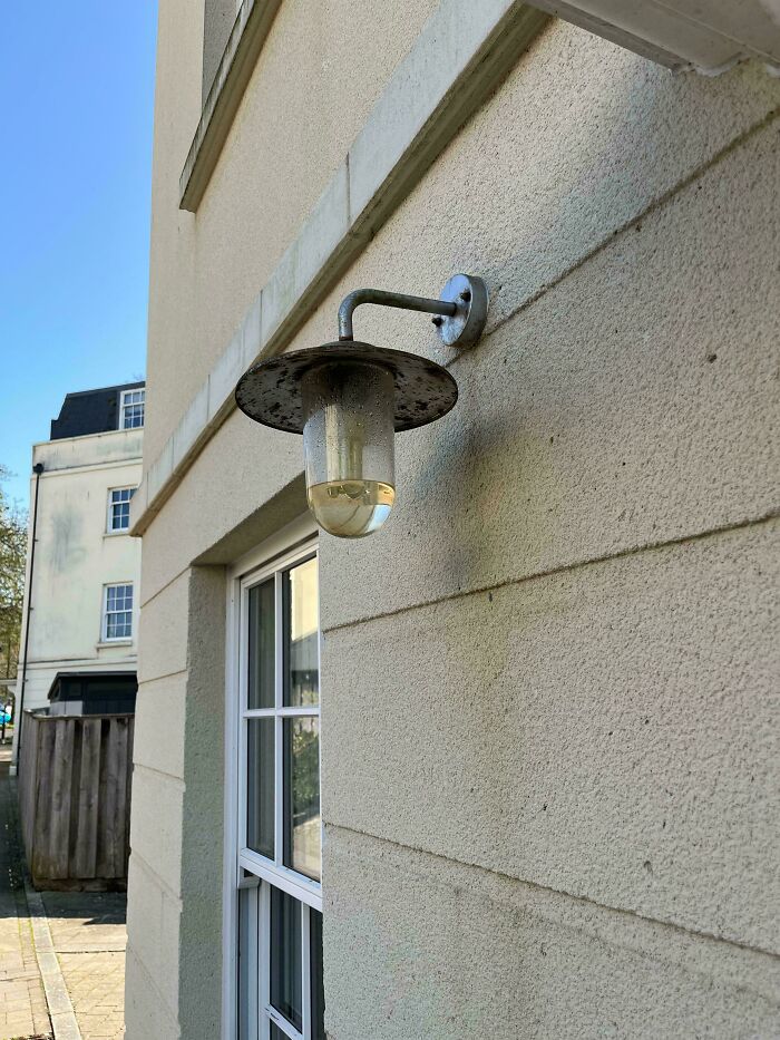
#9 Every Lamp On The Street Is Like This. It’s Hasn’t Rained In A Week
© Photo: EvilDMMk3
German industrial designer Dieter Rams, who spent decades designing products for Braun, came up with 10 principles of good design back in the 1970s. According to him, good design should make a product useful, easy to understand, and pleasant to look at.
He also believed that products should last a long time and avoid unnecessary details. His ideas have influenced generations of designers and are still widely discussed today.
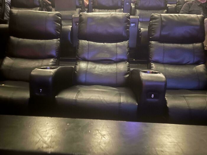
#10 Seat Numbers Are Exactly Between The Seats—every Row Had People Sitting In The Wrong Spot Who Had To Get Up And Move
© Photo: mugglegrrl
#11 Cangshan Knife Handles All Cracking At The Rivet (Despite Never Being Run In The Dishwasher)

© Photo: in2bator
#12 That Does Not Look Like An "M"

© Photo: Excel73_
There’s a good reason why simplicity matters so much. Think about how annoying it is when you spend five minutes trying to figure out which button starts your washing machine or have to click through half a dozen menus just to find something on a website.
Usability expert Jakob Nielsen has developed a set of guidelines for making digital products easier to use. One of his main points is that people shouldn’t have to remember complicated instructions when the information they need could simply be shown to them.
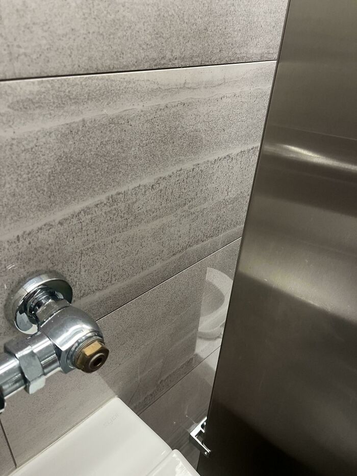
#13 Reflective Tile In My Office Bathroom
© Photo: Odd_Ingenuity_9950
#14 This Panda Plushie With, Apparently, Two Faces, I Found At A Claw Machine I Took My Baby Cousin To See In An Ice Cream Shop

© Photo: AlisanBeDamned
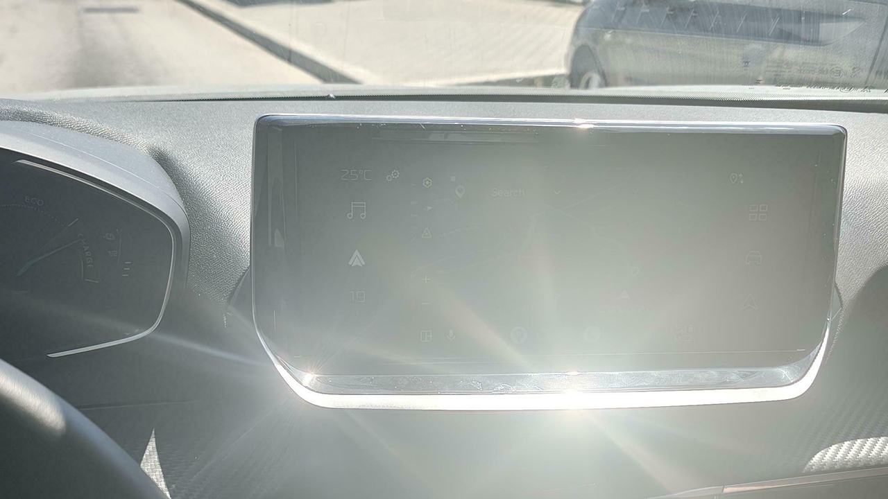
#15 These New Peugeots Are Great, They Blind You With Glare On The Metallic Finish
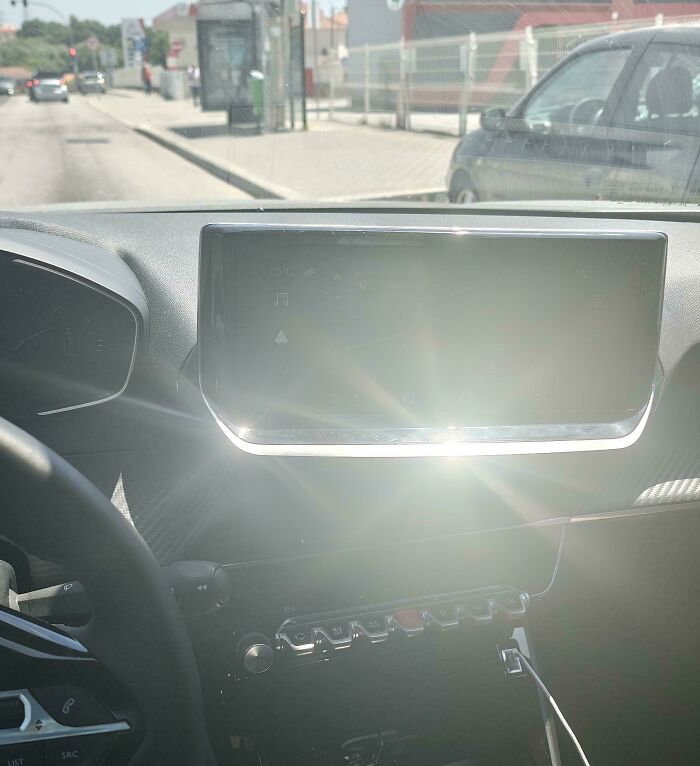
© Photo: ForeverSJC
Another important thing designers need to consider is not just how something will work, but also who will be using it. This kind of approach is called human-centered design, and it involves putting yourself in the shoes of the people you’re designing for.
Sometimes, that means literally watching how people actually use a product, because what they do can be very different from what designers expect. After all, something that seems perfectly logical to its creator might leave everyone else scratching their heads.
#16 Couldn’t Find My Hotel Light Switch
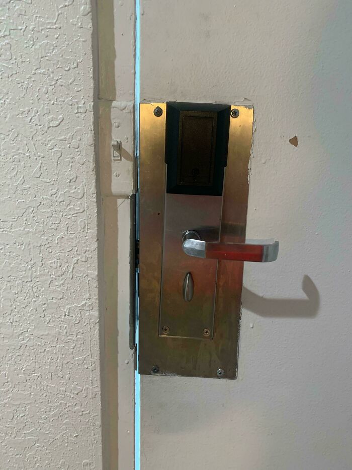
© Photo: Dragongal7
#17 The Tiles At The Hotel I’m Staying At. The Only Way I Know It’s Not Mold Is Because The Pattern Repeats In Other Parts Of The Bathroom
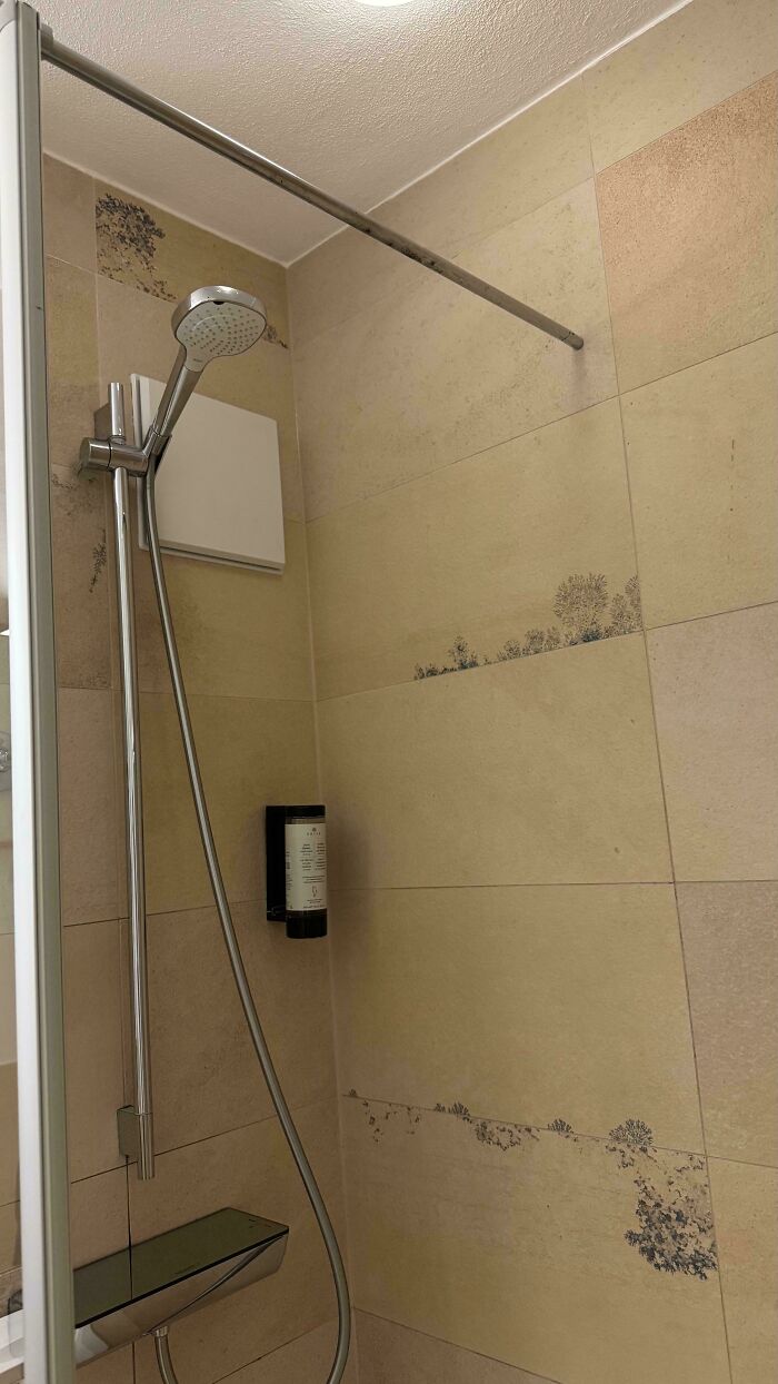
© Photo: Spiritual-Wear-8694
#18 Poison Coffee (It's Supposed To Read As "Up Tension")
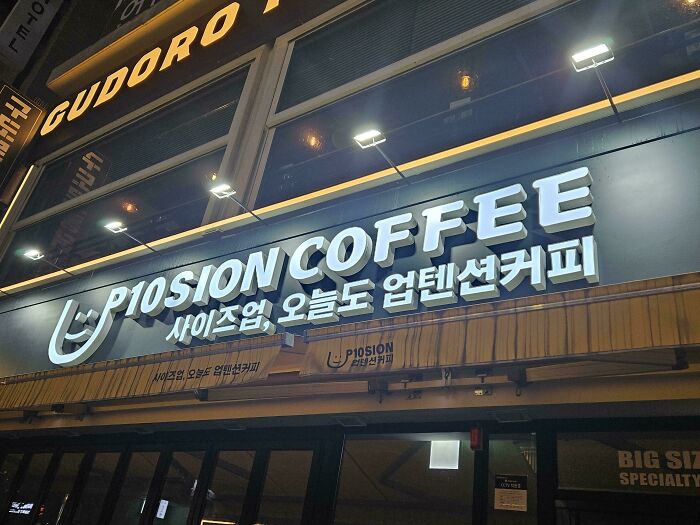
© Photo: smkndofCJ
A great example of this is the story behind OXO’s Good Grips kitchen utensils. According to the Smithsonian, the idea came to Sam Farber after he noticed his wife, who had arthritis, struggling to use kitchen tools with metal handles.
He decided to create something more comfortable, and in 1990, the company introduced a line of utensils with soft, easy-to-hold rubber handles. The idea was simple, but it made everyday tasks easier for people with different needs.
#19 Hard To Read The Menu At New Restaurant
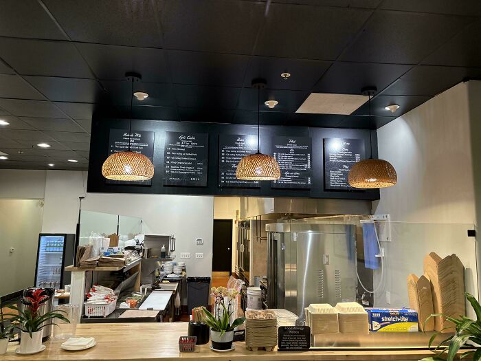
© Photo: diccc
#20 These Signs Are Giving Me Confusion
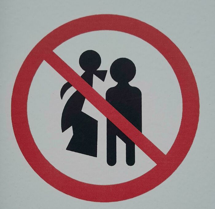
© Photo: Blcksheep89
#21 Hospital Bathroom Light Switch That Looks Just Like The Emergency Buzzer
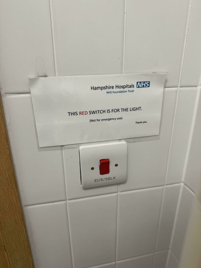
© Photo: lost_medic
Another famous design success is the London Underground map. Back in the 1930s, the city’s growing train network was becoming increasingly difficult to fit onto a regular map.
So designer Harry Beck came up with a completely new approach, using simple lines and colors to make the routes easier to follow. His design was initially rejected for being too radical, but it was eventually introduced in 1933 and went on to inspire subway maps around the world.
#22 Uneven Surface, Bad Slope And Locked Down Wheelchair Access
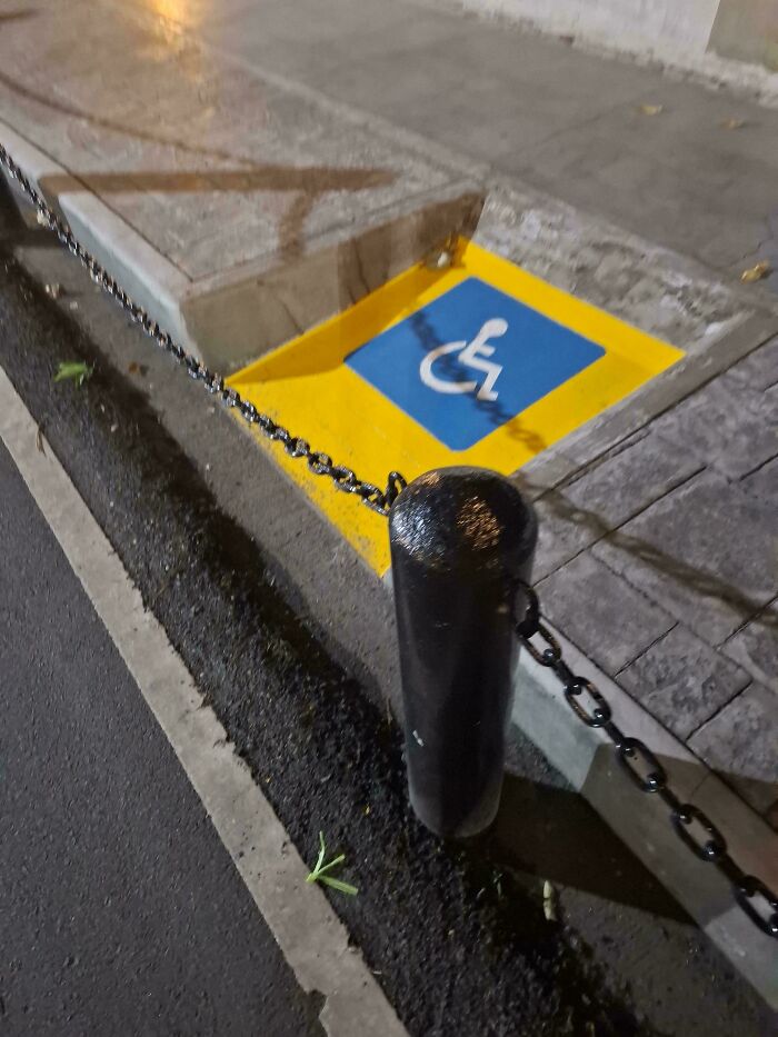
© Photo: mitrtown
#23 The New Southwest Signs. People Don’t Know Which Side To Stand On… It Needs Arrows For Those Who Can’t Tell Orange Is Right And Blue Is Left
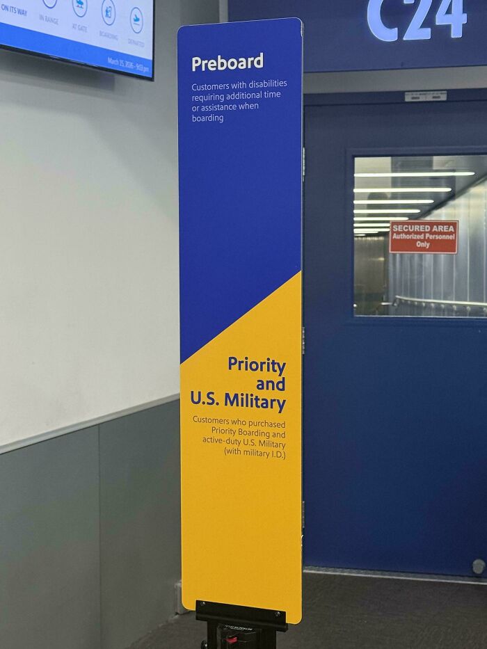
© Photo: Coalrober
#24 So It’s 3/4 Peppers… From The Right.. And It’s The Hottest?
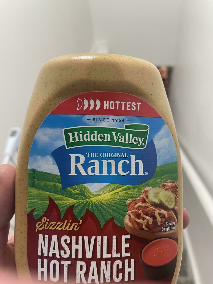
© Photo: TurtleBarn
There have also been many spectacular examples of designs that didn’t work out quite so well. Remember Juicero? In 2017, the company was selling a $400 internet-connected machine designed to squeeze juice from special packets of fruits and vegetables.
The problem was that Bloomberg discovered people could squeeze the packets by hand and get almost the same amount of juice, sometimes even faster. The company shut down just a few months later, making the expensive gadget one of the more memorable product failures of its time.
#25 I've Been Staring At This Sticker On The Bus For 8 Hours, And I Have No Idea What Is Trying To Say
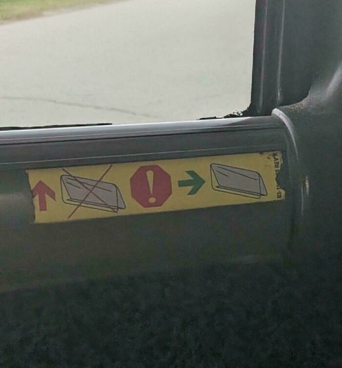
© Photo: notnotbrowsing
#26 The Logo Of The European Space Agency (Esa) Just Looks Like Eesa

© Photo: GreenEggsInPam
#27 This Chicken Tender At KFC Looks Like A Rat At First Glance
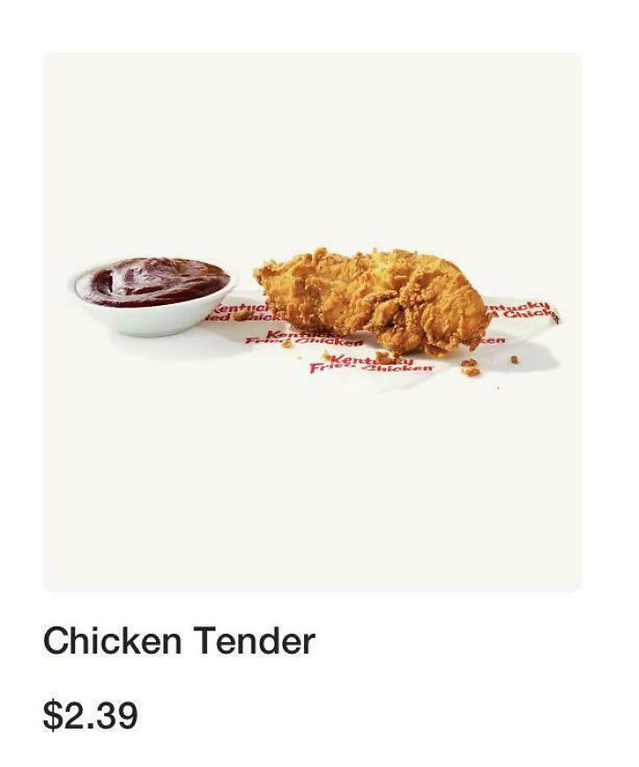
© Photo: LobstahLive
And that’s perhaps the funny thing about design. When something works exactly as it should, we rarely stop to appreciate how much thought went into it. But when a door opens the wrong way or a sign leaves us more confused than before, we notice immediately.
At least these mistakes give us something to laugh about, and maybe they can even remind future designers to test their ideas before sharing them with the world.
#28 A Token Of Appreciation From My Boss. Only Points Down When Read Correctly
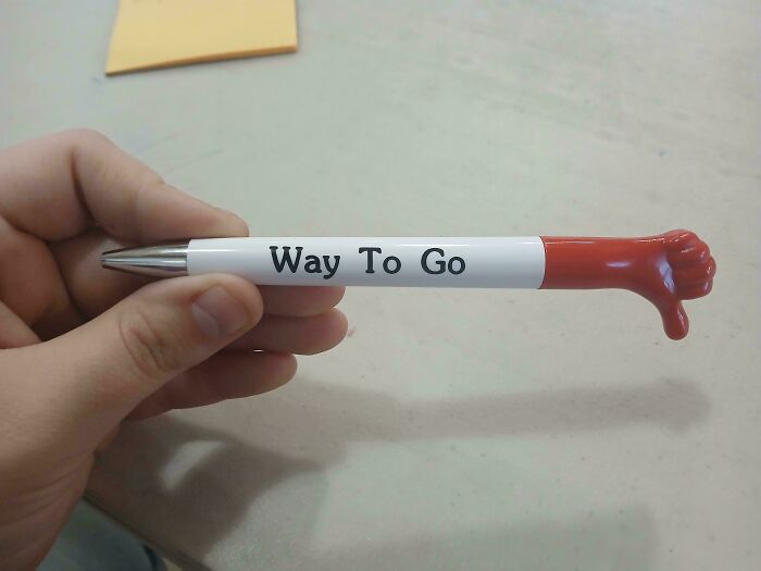
© Photo: Lili-Saramira
#29 I’m Not Sure How To Hold This Coffee Mug
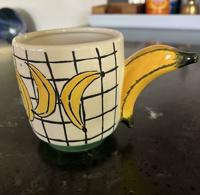
© Photo: SilverNature3
#30 For A Second, I Thought It Was Binary!
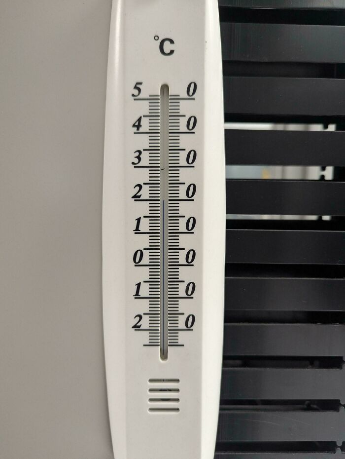
© Photo: iZraHell
#31 This Pretty Much Unusable Chessboard Setup The City Built On My Street
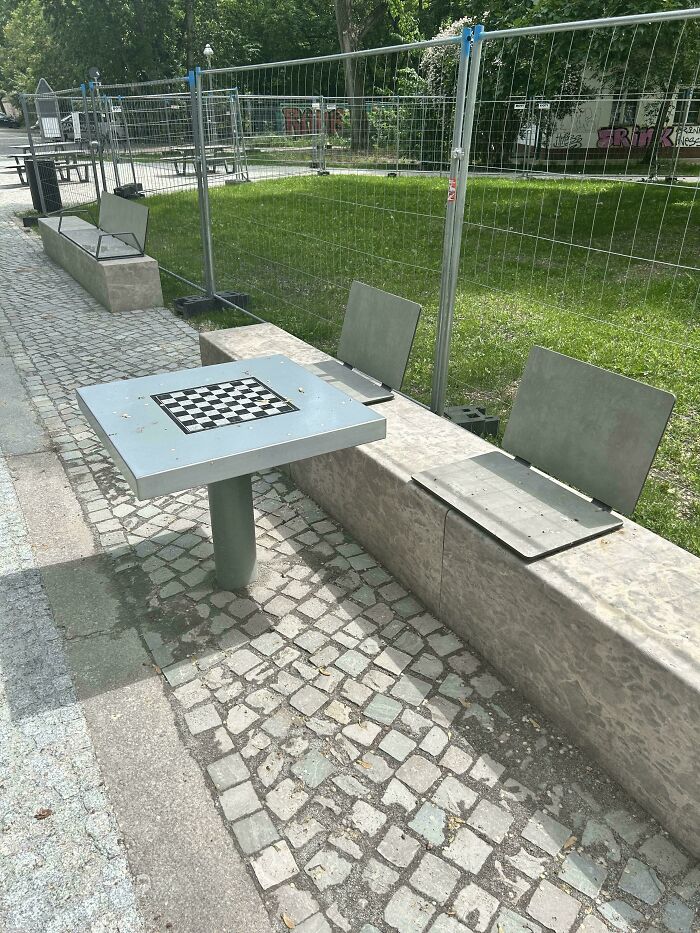
© Photo: GoraSou
#32 My Walking Pad Remote Made The Traditional ⏯️ Button Catapult You To 3mph And I Hit It Every Time I Need To Pause The Workout
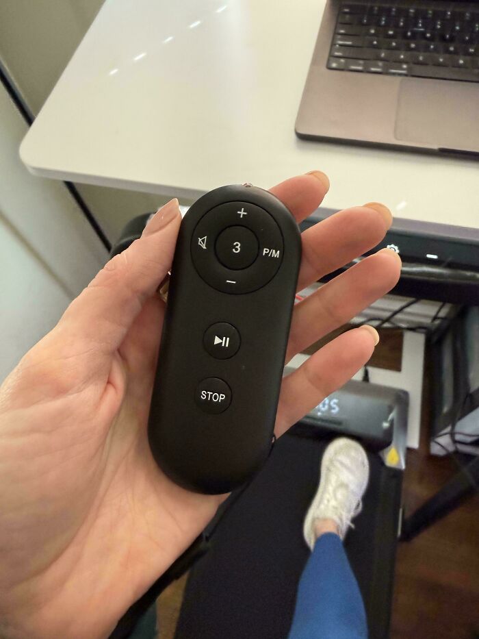
© Photo: laundreedae
#33 The And The

© Photo: No-Actuary-1671
#34 What Is The Dadgum Expiration Date On This Chobani Yogurt Cup???

© Photo: DunDonese
#35 Seen On An Airplane - What?
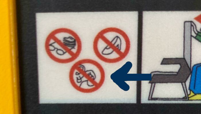
© Photo: O_M_I_C
#36 Backpack That Has Zippers On The Bottom Leading To The Main Bag That Open Up Automatically When You Put Too Much In
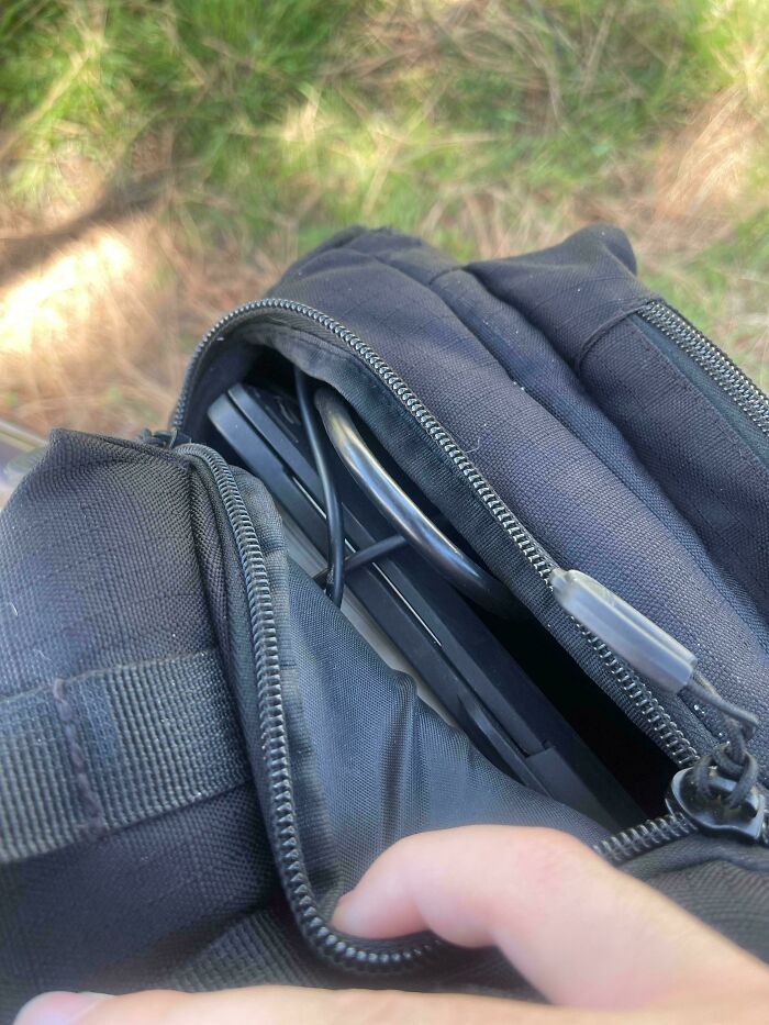
© Photo: Outside-Refuse6732
#37 Eye Care For Cretins
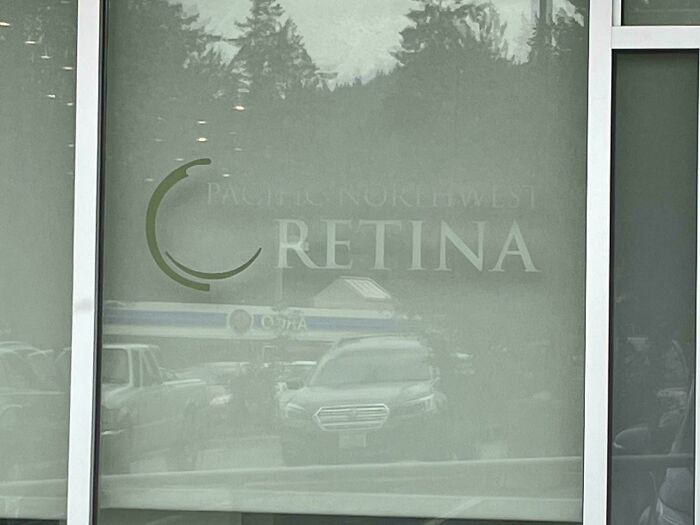
© Photo: Hopping_Glad
#38 I'm Sure They Make A Lunch Not Worth Losing
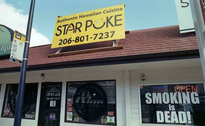
© Photo: FinancialRice7291
#39 This Ear Thermometer Always Shows The Room Temperature Which Drains The Battery. It Requires A Battery Change Before Use Every Time Because Of It
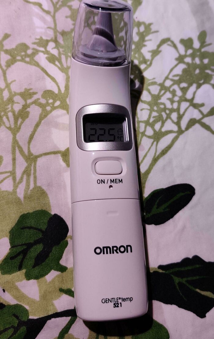
© Photo: Raqdoll_
#40 A Crosswalk To A Literal Dead End On The Other Side
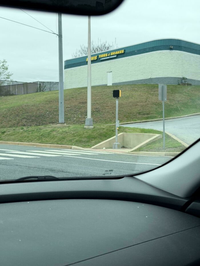
© Photo: rdevlin92
#41 Accessibility Is Key.. So Let's Block It
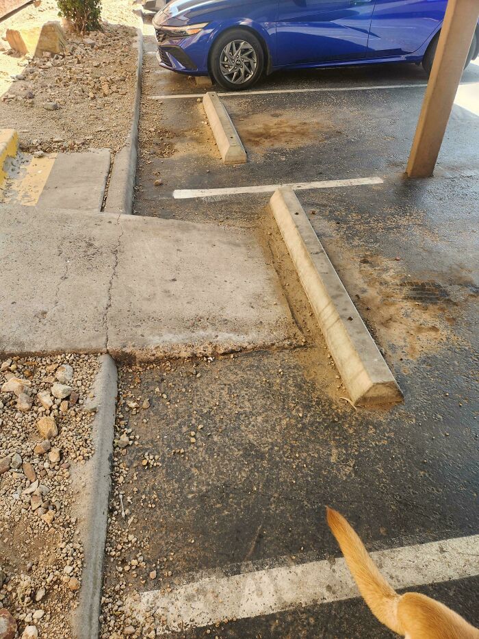
© Photo: Formal-Individual-44
#42 I Was So Confused LOL , I Was Thinking “Made In A What”
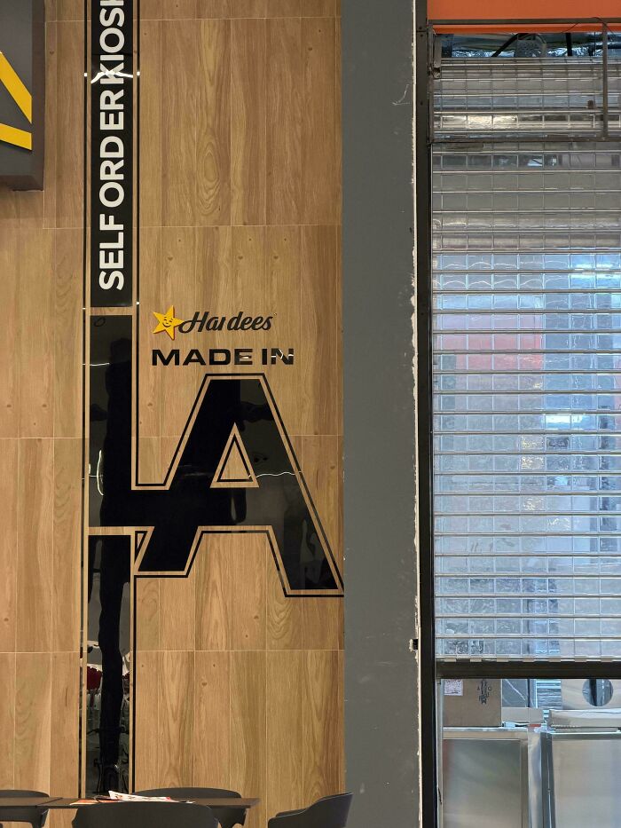
© Photo: MaintenanceDry9260
#43 I Read This As “Dpcphsptsthl” Because Someone Thought People Would Just *Know* To Approximate The Greek Letters To Their Rough Latin Lookalikes
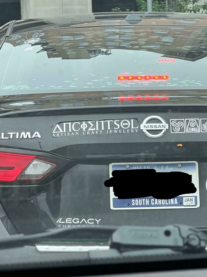
© Photo: bumbl_b_
#44 Apparently The Bot Hates The Fact That Calling Out The Ad Looking Like Peed Dating Was Not Enough To Point Out Bad Design
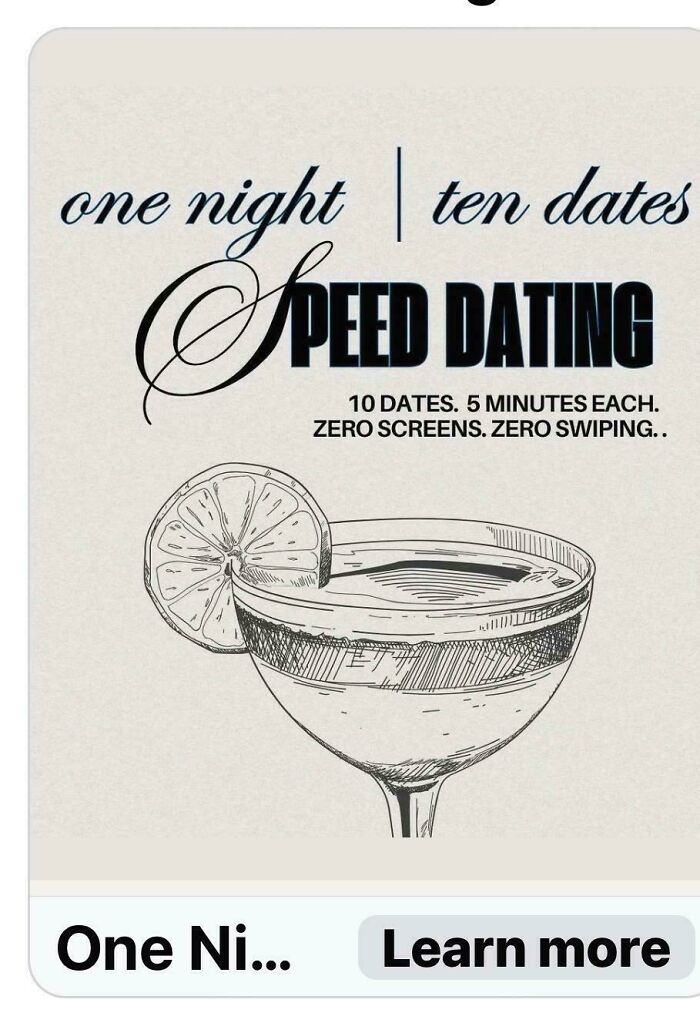
© Photo: mysteryphotogatl
#45 Airline Just Slapping A Jpeg On Their Plane

© Photo: alphagusta
#46 Impossible To Clean This Food Processor’s Bowl Handle
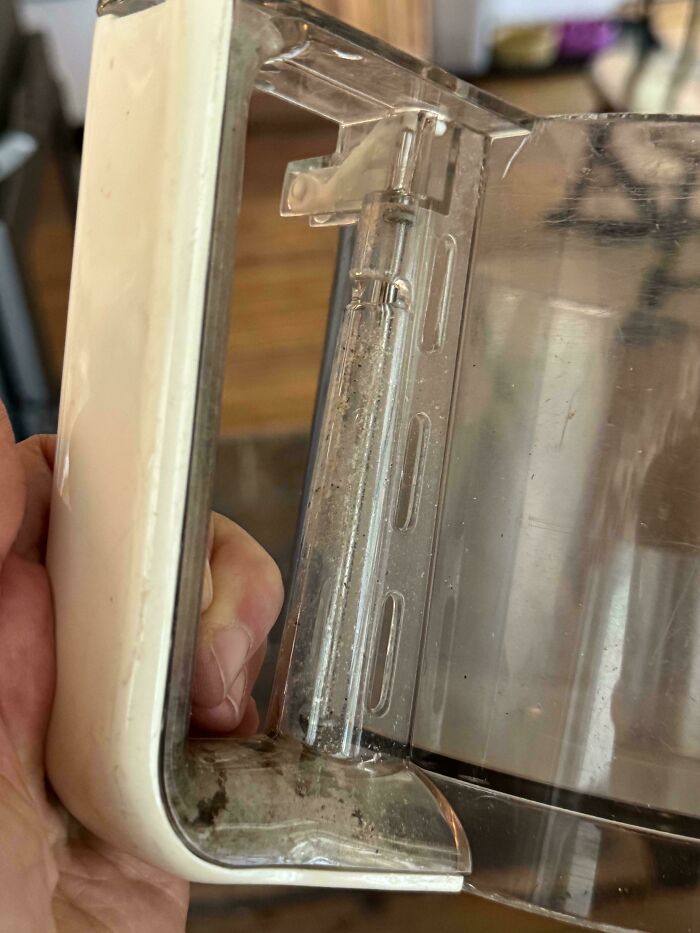
© Photo: Due_Ad2549
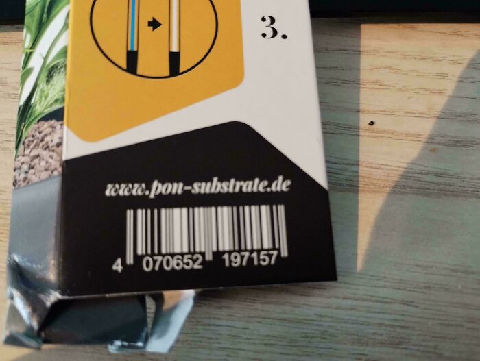
#47 White-On-Black Barcode, That Couldn't Be Scanned At The Register
© Photo: korfi2go
#48 Took Me Sec To Understand What It Said. Tunashamed

© Photo: OtherwiseExternal777
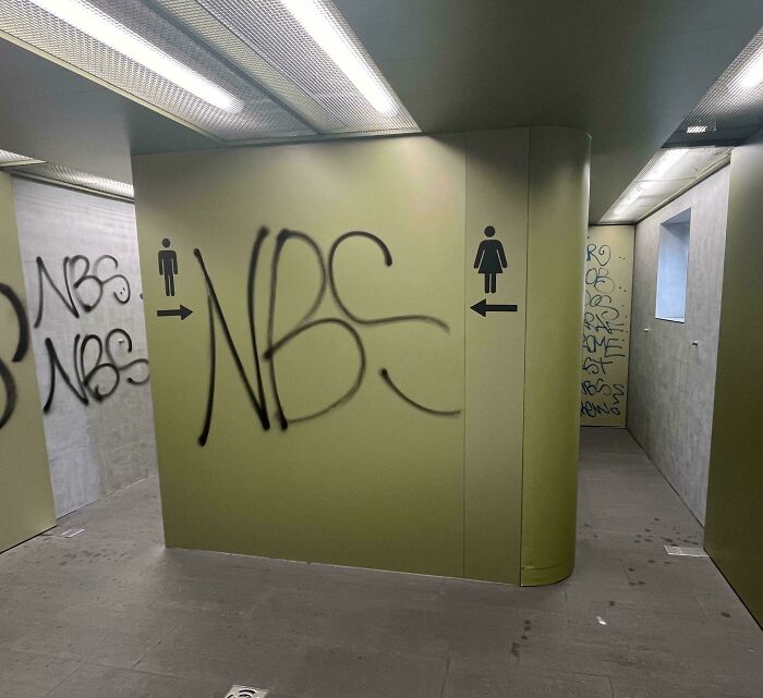
#49 Guess Which Is Which
© Photo: Basmati1220
#50 Recently Bought This Drink, And Only Just Now Noticed That It Doesnt Say "Strawberry", It Says "Stwrabrery"

© Photo: t0oby101
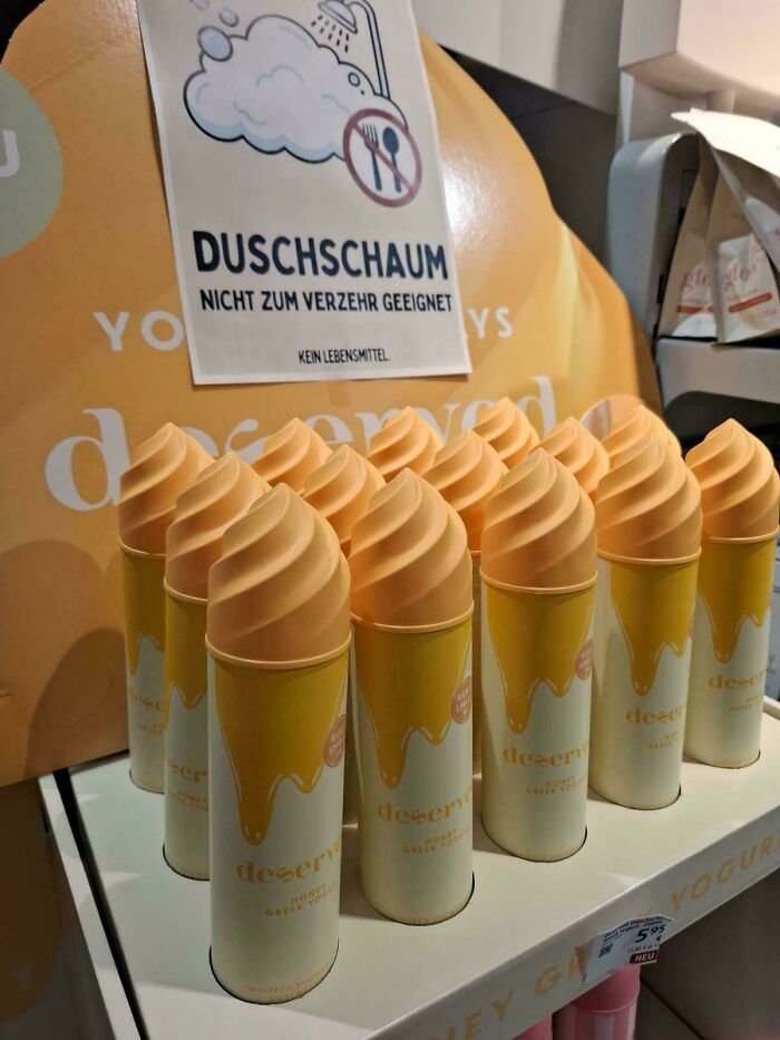
#51 This Bath Foam Packaging Looks So Much Like Food That They Had To Put Up A Warning Sign Behind It
© Photo: Lords_of_Misrule
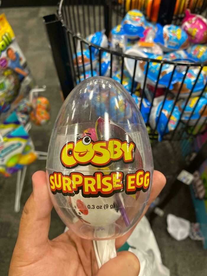
#52 Ah Yes, A See-Through “Surprise” Egg
© Photo: AsingleMiitopian46
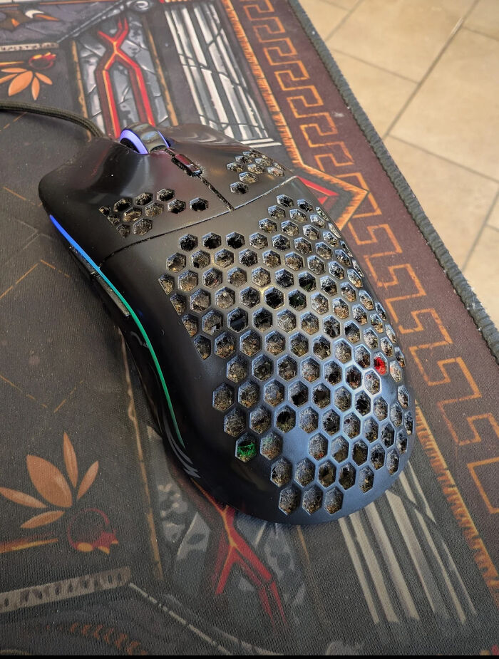
#53 Pure Fun To Clean
© Photo: Wermikulit
#54 They Used A Brown Gradient To Make The Logo Readable And Accidentally Giving The City A Post-Apocalyptic Smog

© Photo: lazy_tenno
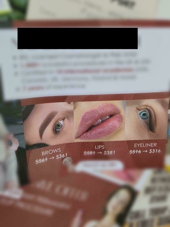
#55 Ad For Cosmetic Enhancements 👁👄👁
© Photo: faraway_fern
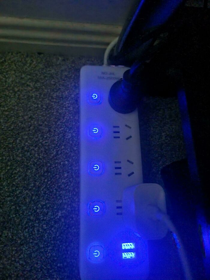
#56 Ultra Bright Switchboard Leds
© Photo: CarefulCurate
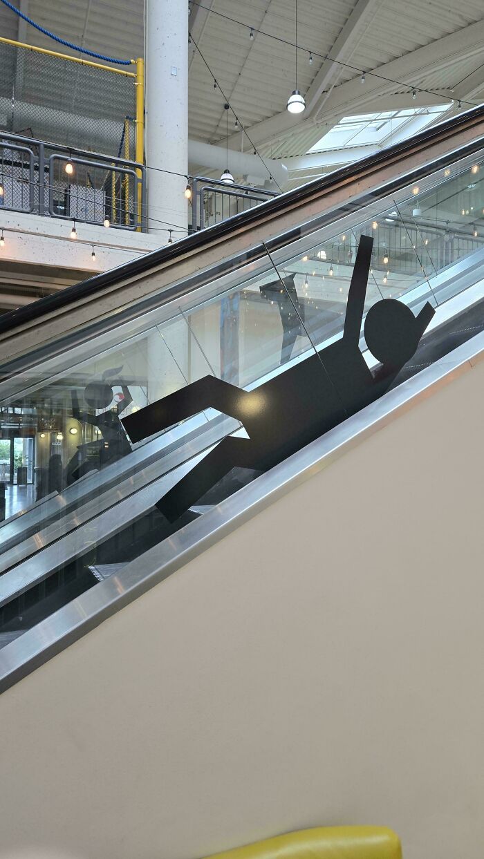
#57 These Stickers On The Escalator That Appear To Be Encouraging Children To Slide Down Outside The Railing
© Photo: JoeBrownshoes
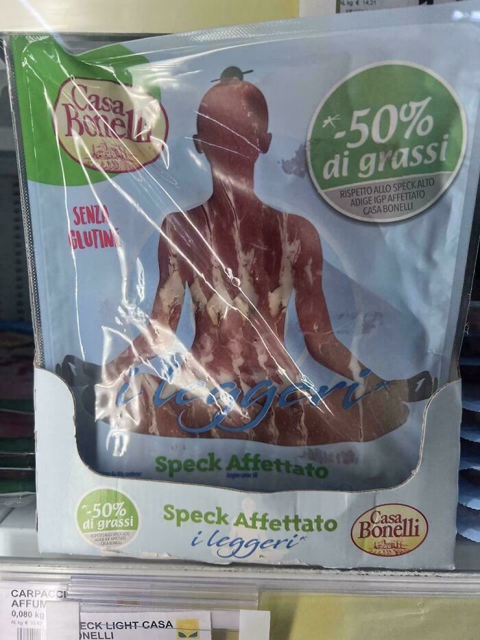
#58 The Least Appetizing Way To Present Sliced Meat In An Italian Supermarket
© Photo: KyouCat
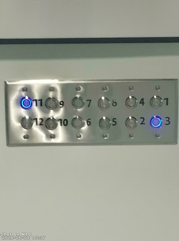
#59 Numbering System At A Therapists Office
© Photo: Nearby_Inflation2009
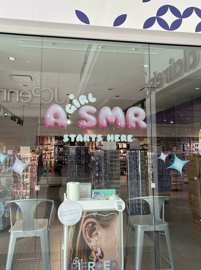
#60 A Girl Smr
© Photo: serena_violette
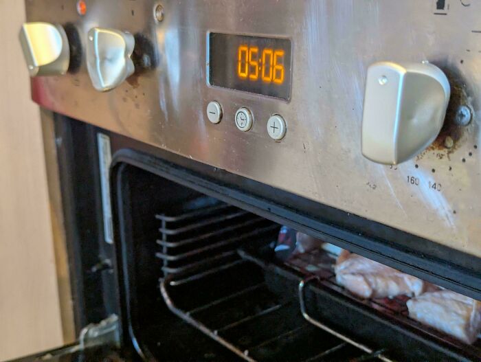
#61 Plastic Knobs Above The Grill. Awesome
© Photo: BarryTownCouncil
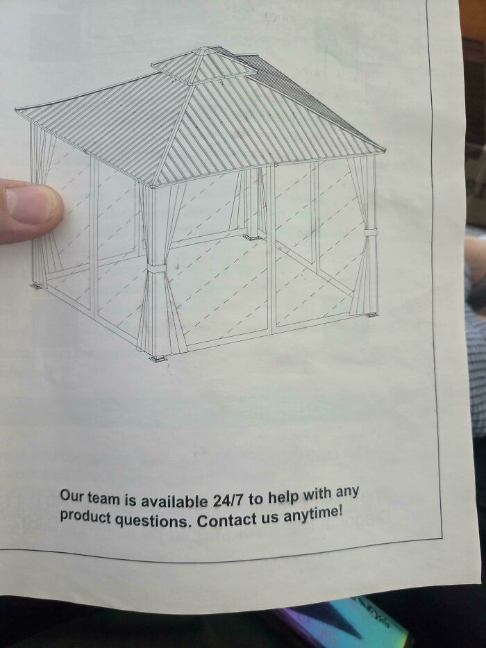
#62 24/7 Help Line. But No Number Anywhere To Be Found
© Photo: skyguy10ply
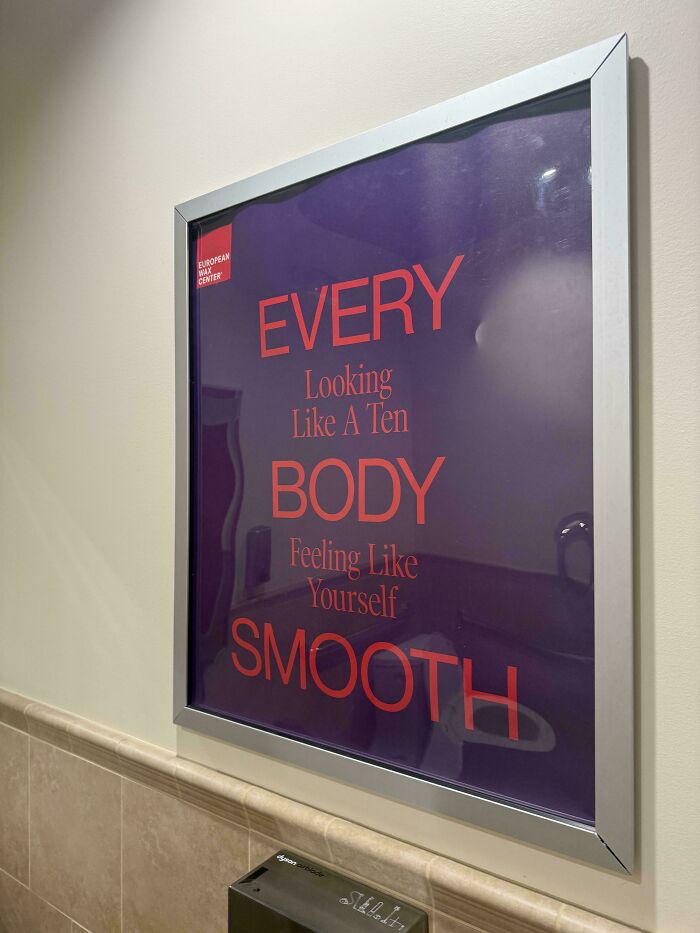
#63 Am I Dumb Or Does This Make No Sense?
© Photo: TitoBlue_
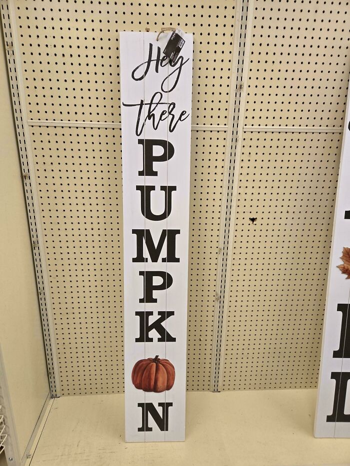
#64 I Cannot See Anything Other Than "Pumpkon"
© Photo: Mann_Peach
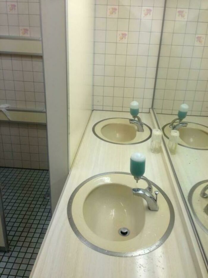
#65 Highly Accessible Sink I Found In A Japanese Restroom
© Photo: wtclover
#66 The Van And Equipment At The Local Funfair's Logo. They Advertise As Being Specifically Designed For Children; Somehow, I Have My Doubts
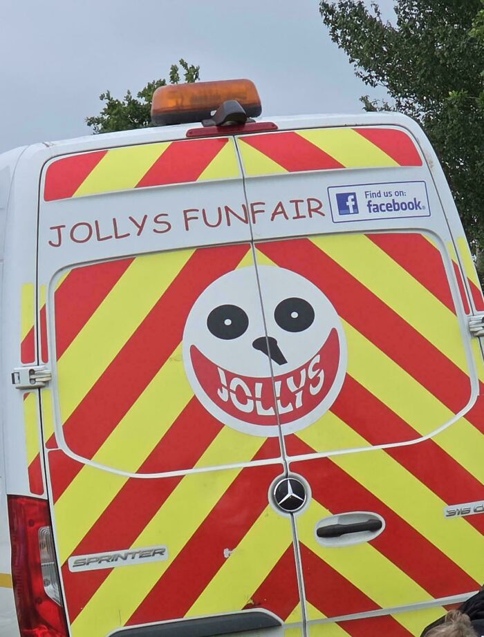
© Photo: chonker-feet
#67 Toyota Proace Does Not Have Its Drivers Seat Centered To The Steering Wheel And Dashboard
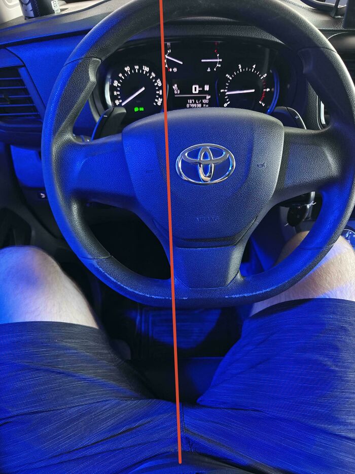
© Photo: Duffelbach
#68 I Love My Local Pizza Place But Dang If This Don’t Look Like Vomit
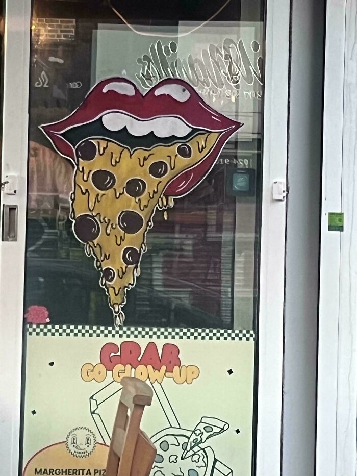
© Photo: schweinhund89
#69 Good Luck Blind People!
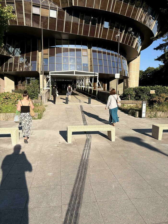
© Photo: PeakGroundbreaking61
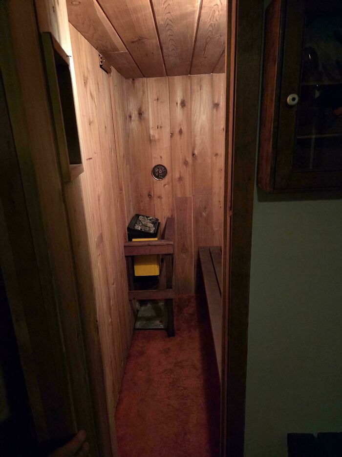
#70 Found The Carpeted Sauna Again
© Photo: soggyfrodo
#71 “Good Luck, Blind People” Part II. Braille On A Metal Sheet In The Burning Hot Greek Sun

© Photo: Virtuosory
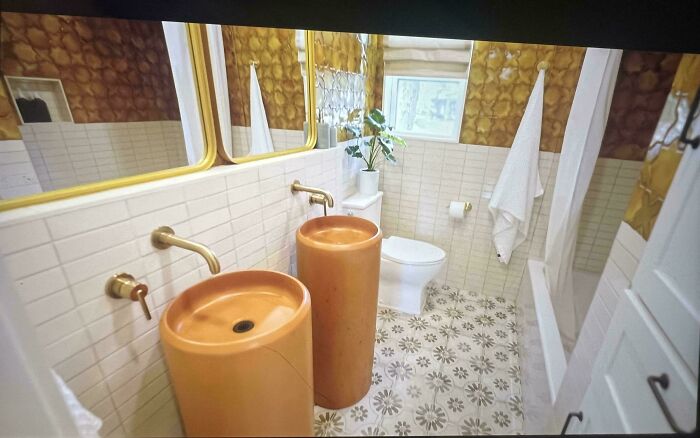
#72 Only Other Bathroom Aside From Primary Suite In Home W/ 2 Adults, 2 Young Kids. Where To Put Toothbrush, Hair (& Makeup) Stuff, Handsoap?! Terrible Children's Bathroom Reno By Kim Wolfe On Hbo / Hgtv
© Photo: catshifturr
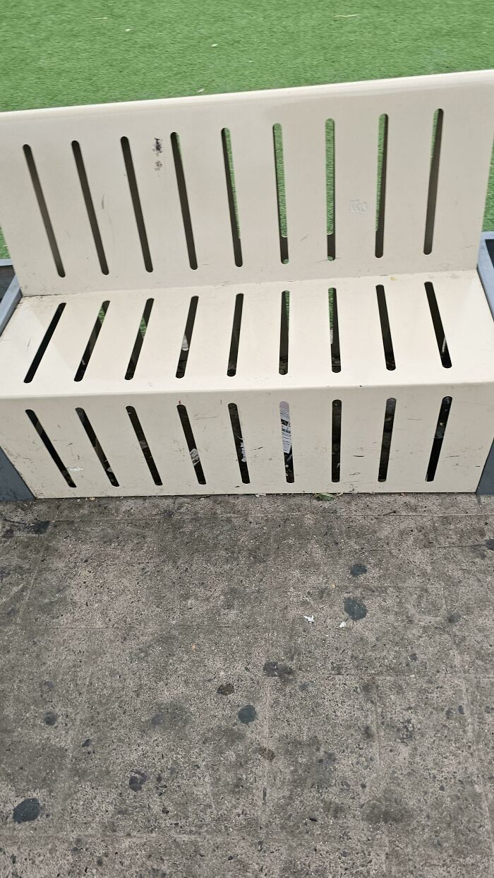
#73 Public Benches That Have Holes But No Way To Clean Them
© Photo: Roy_yiii
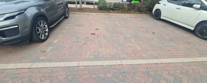
#74 Parking Bays, Nightmare To See As A Colorblind Person And Near Impossible To Park Within The Lines At Night. Should Have Been Solid White Lines
© Photo: TraderNono
#75 This Ultra Sharp Knife Has No Way To Lock It Open Or Closed
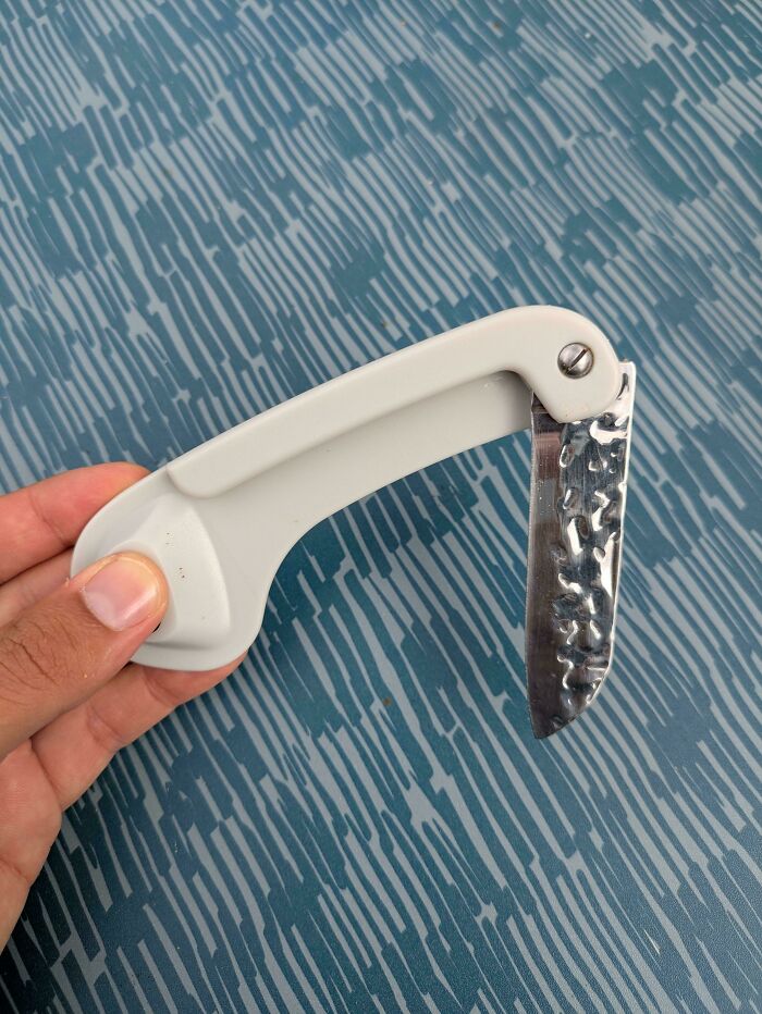
© Photo: someguywithdiabetes
#76 There’s A Special Place In Hell For Whoever Designed This Tape Measure With A Rounded Bottom So It Falls Over When You Put It Down To Mark Something
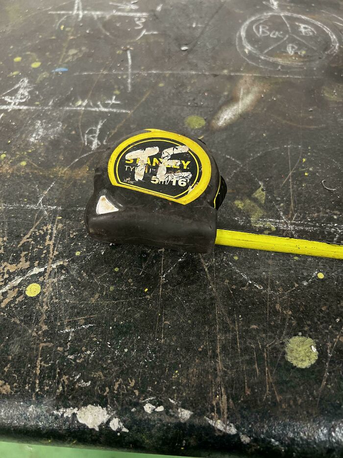
© Photo: Tango91
#77 $200 Dollar Fan That I Can’t Turn Off The Lighting. It’s Blinding Bright

© Photo: Medical-Net-7350
#78 The Headwacker 3000 At The Hotel I'm Staying
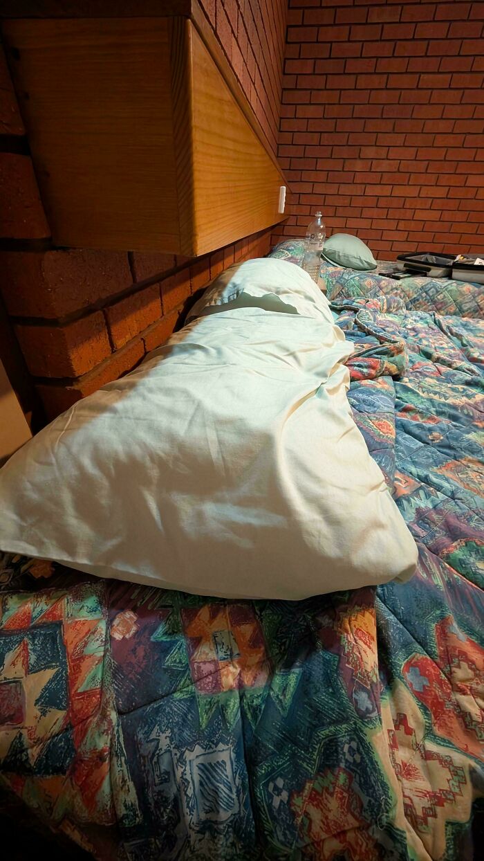
© Photo: salty_lyfe
#79 Oh, Sorry, Did You Want To Watch The Tennis Match?

© Photo: pbj45
#80 "Tear Away" Tag. So That Was A Lie
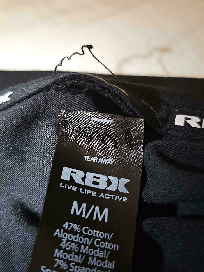
© Photo: RayzTheRoof
#81 It's From A Design School Too
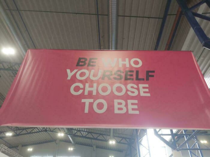
© Photo: Right-Dot4471
#82 Menu Only Available Through Reflective Qr Code
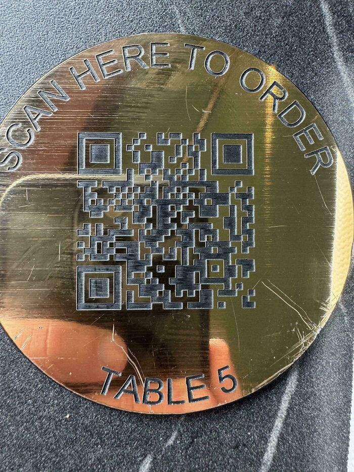
© Photo: Professional_Shine97
#83 A Not So Wheelchair Accessible Door That Has A Push-To-Open Only On The Inside
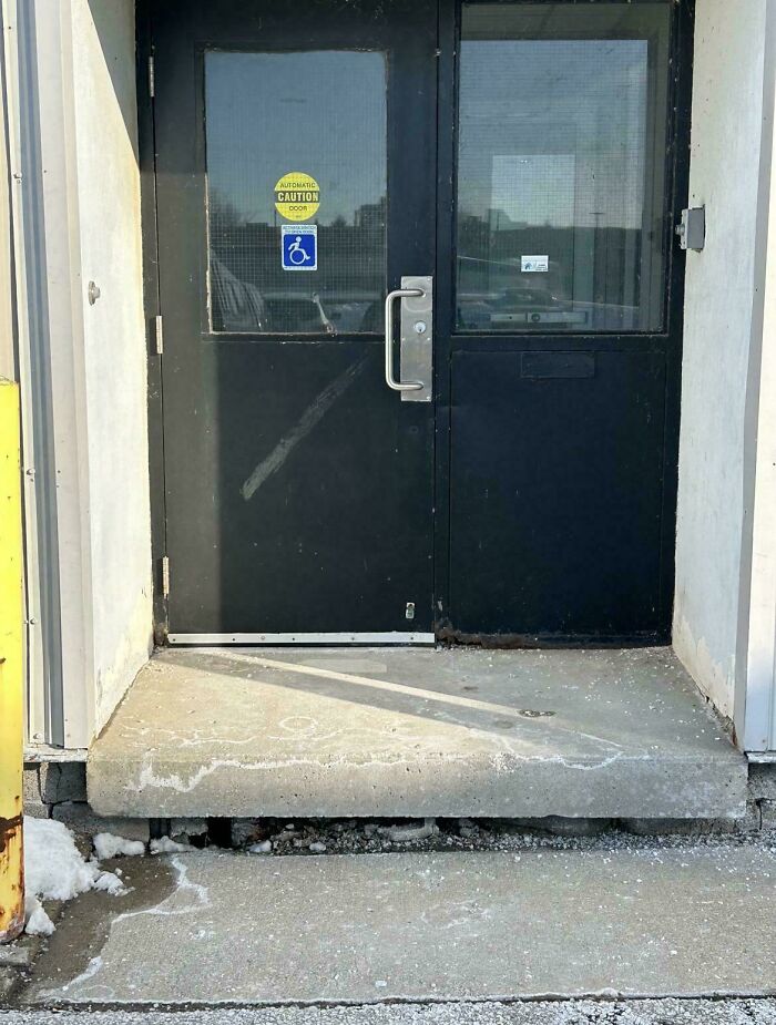
© Photo: ChubbyDucky48
#84 This Clipboard Packaging Is Applied Under The Metal Clip, So If You Rip It While Removing, It Gets Caught There Permanently
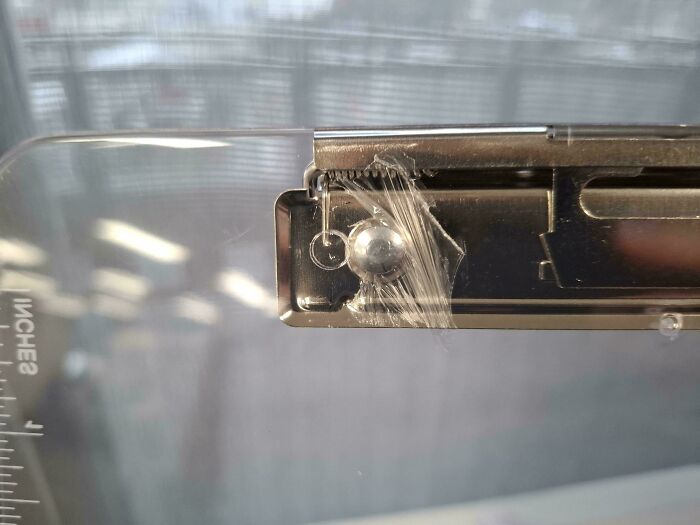
© Photo: Competitive_Paper841
#85 New Front Steps From A Local Sub
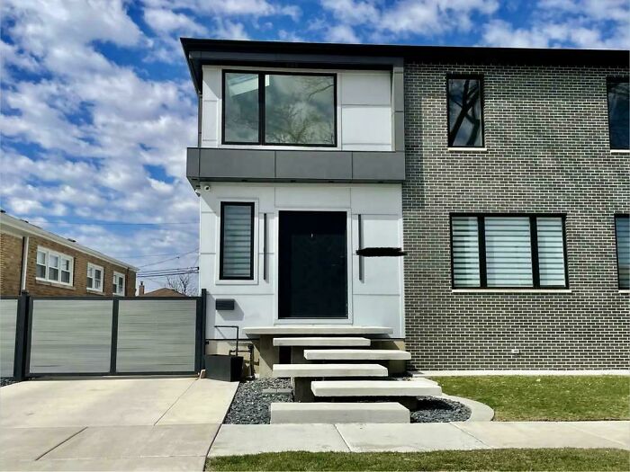
© Photo: SpringtimeInChicago
#86 Glum Restaurant And Lounge
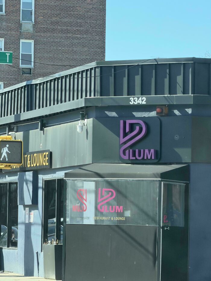
© Photo: ViaTheVerrazzano
#87 Ford Have Started Putting These Flimsy Fuel Filter Casings On Their Diesel Engines And They're Barely A Step Up From Papermache. Colleague Didn't Even Notice It Had Snapped While Removing Clip On Line
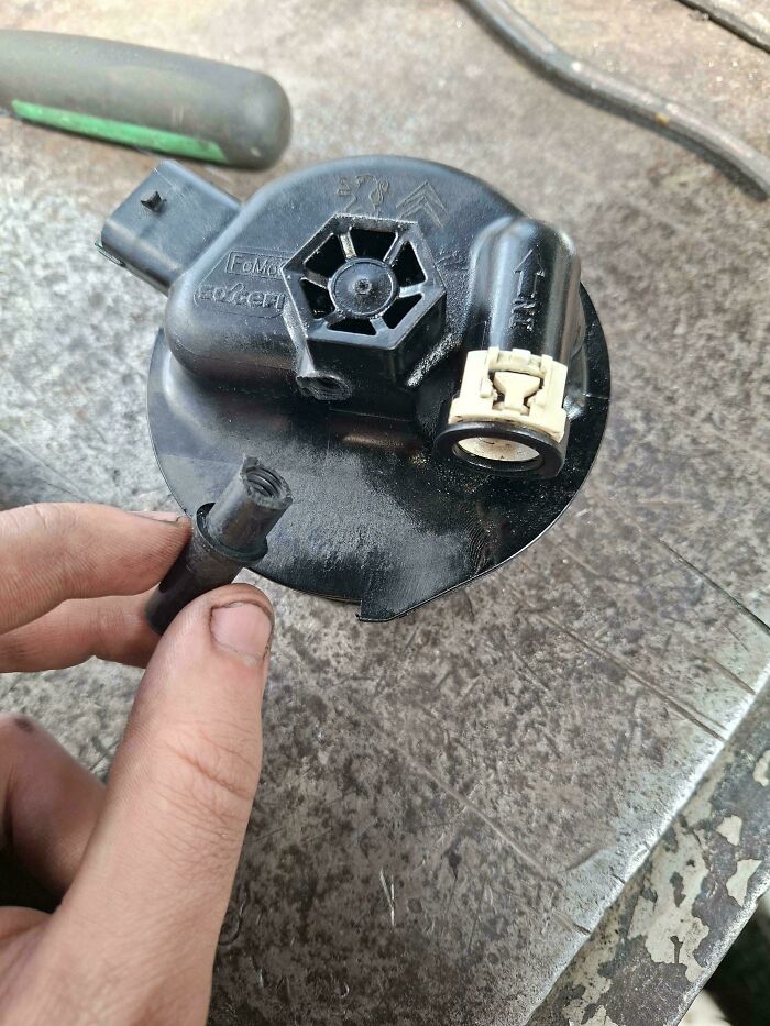
© Photo: Titan5115
#88 My Dad Is Adamant On Adding A Window Here
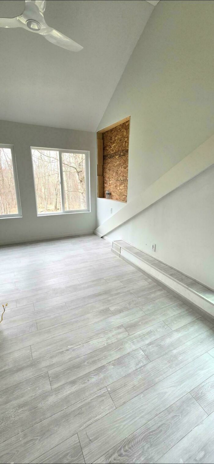
© Photo: Muted_Introduction26
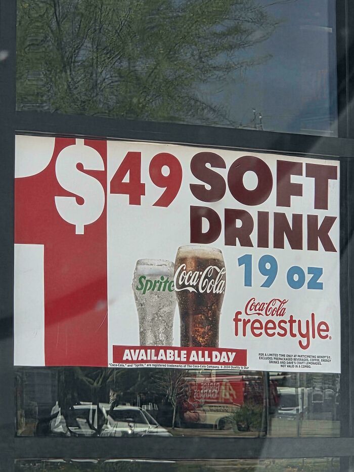
#89 At First Glance I Didn't Pick Up On What It Was Saying, I Was Thoroughly Confused. Also For A 19oz That's Pitiful
© Photo: Aedrikor
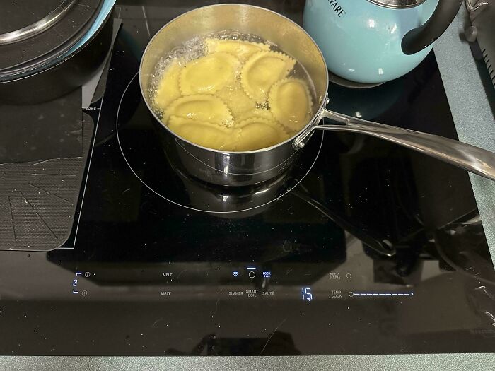
#90 Absolute Worst Stove Replacement. Touch Screen That Doesn’t Register Some Of The “Buttons”
© Photo: NotAverageEnough
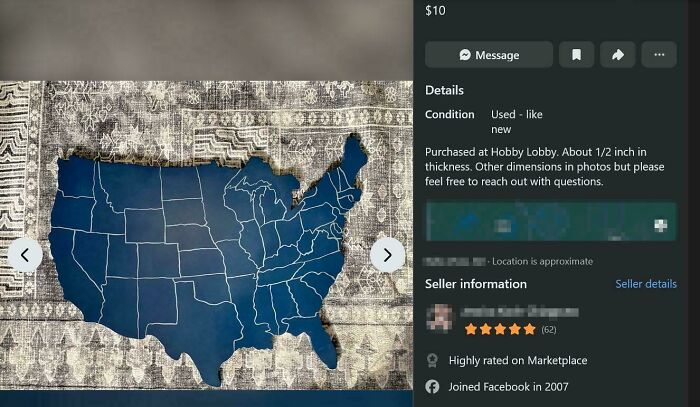
#91 Wooden Marketplace Us Map Apparently Sold By Hobby Lobby Has Taken Some Serious Liberties With Borders
© Photo: ZhouLe
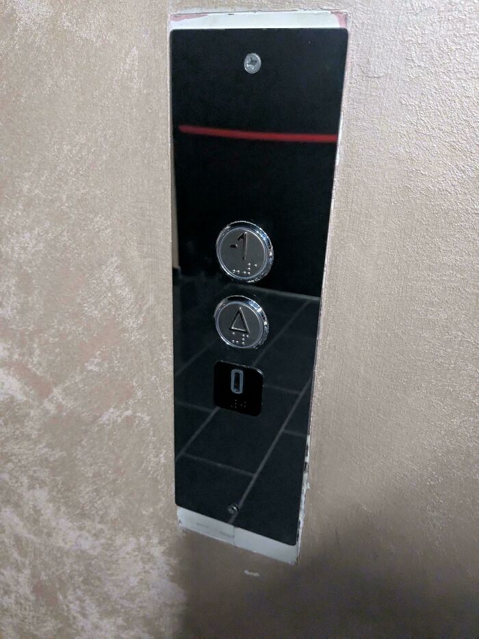
#92 From The Ground Floor, Pressing The Uppermost Button Will Take You To -1
© Photo: CommaSeparatedValu3s
#93 New Bike Rack At Local Supervalu Shop - Does This Mean You Can Or Can't Park Your Bike?

© Photo: BillyMooney
#94 My Kid’s Employee Information Form Had Her Struggling To Decide Between Checking The Checkboxes Or Circling Them…
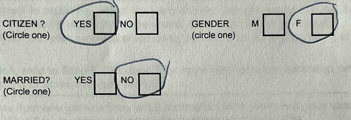
© Photo: Mattyi
#95 400€ BBQ, Black Text (Around The Turn Dials) On Black Background
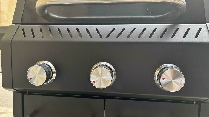
© Photo: CADyourLife
#96 If You See Say.. Something Something
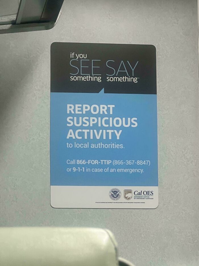
© Photo: capsulex21
#97 I Have An Irrational Fear Of Slipping And Being Impaled By This Bluey Soap With Pointy Plastic Ears
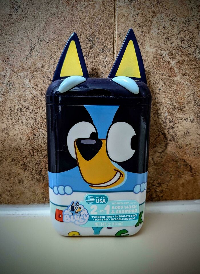
© Photo: VoidAssembly
#98 Was Looking For A Bag But This One Doesn't Look Very Spacious
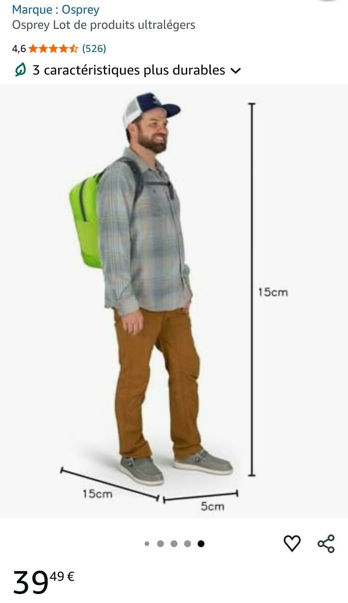
© Photo: theredalchemist
#99 Definitely The Best Way To Line Up This House Number And Lighting Fixture
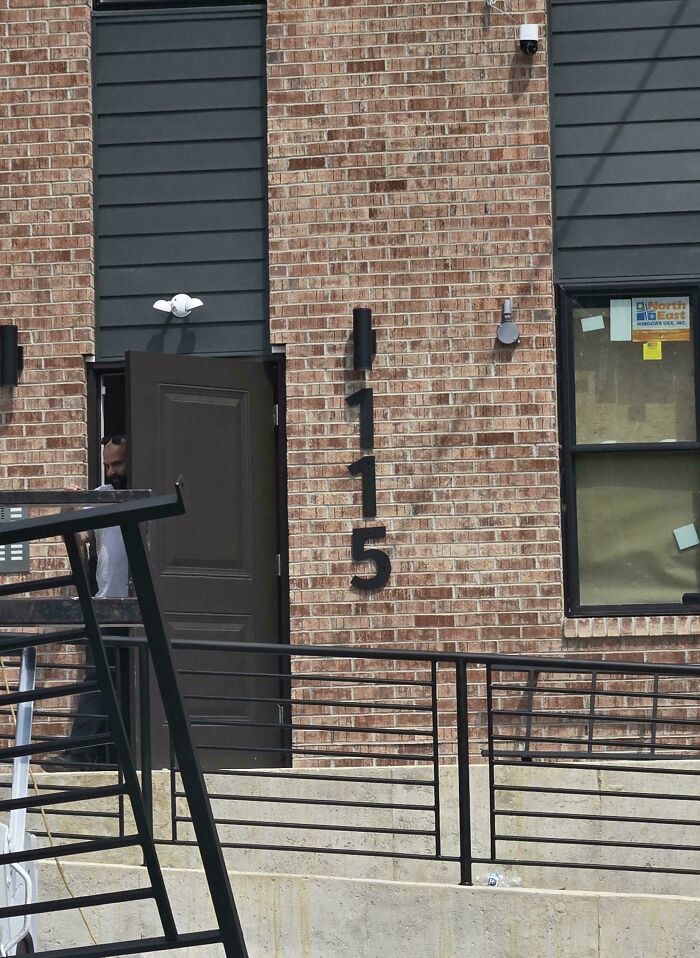
© Photo: diatriose
#100 Lets Put The Pledge Right On The Flag So Everyone Can Read It In Black Comic Sans
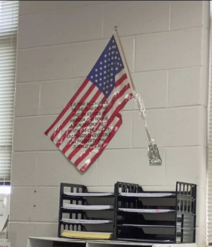
© Photo: Crafty_Piece_9318
#101 Perforation Fail! Never Seen One Of These That Actually Works
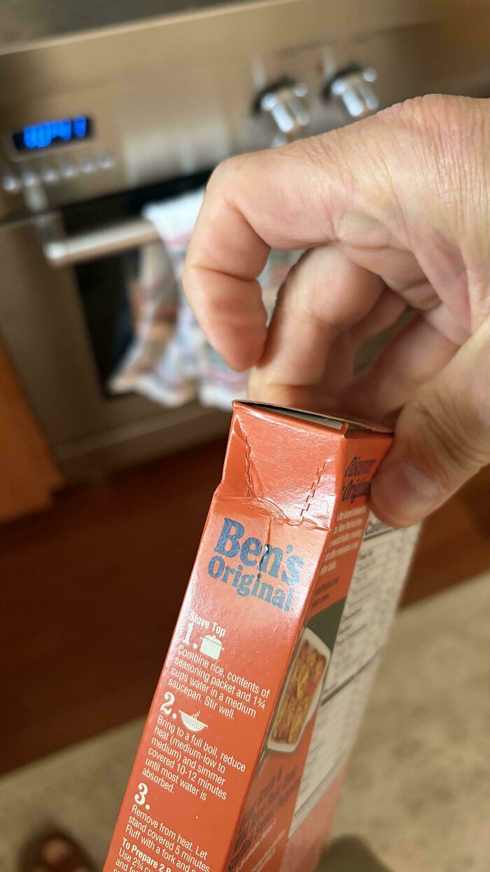
© Photo: SpecificSorry7233
#102 My New Zenbook 14 Gets Discolored Each Time You Touch It Even If Your Hands Are Clean
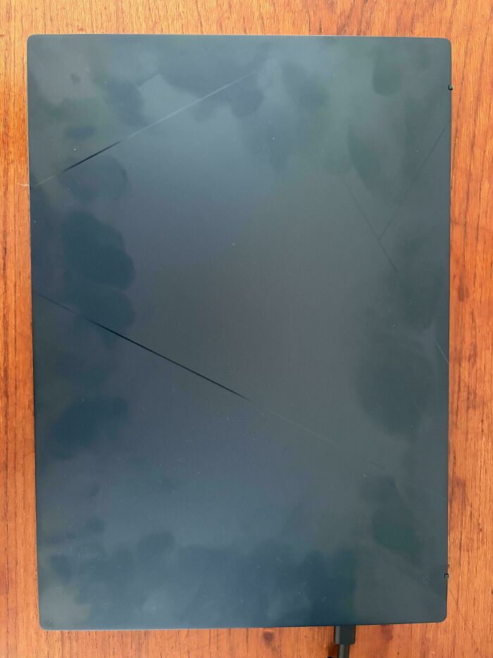
© Photo: Fair_Oven5645
#103 Only One Toilet With A Door In Woman’s Restroom
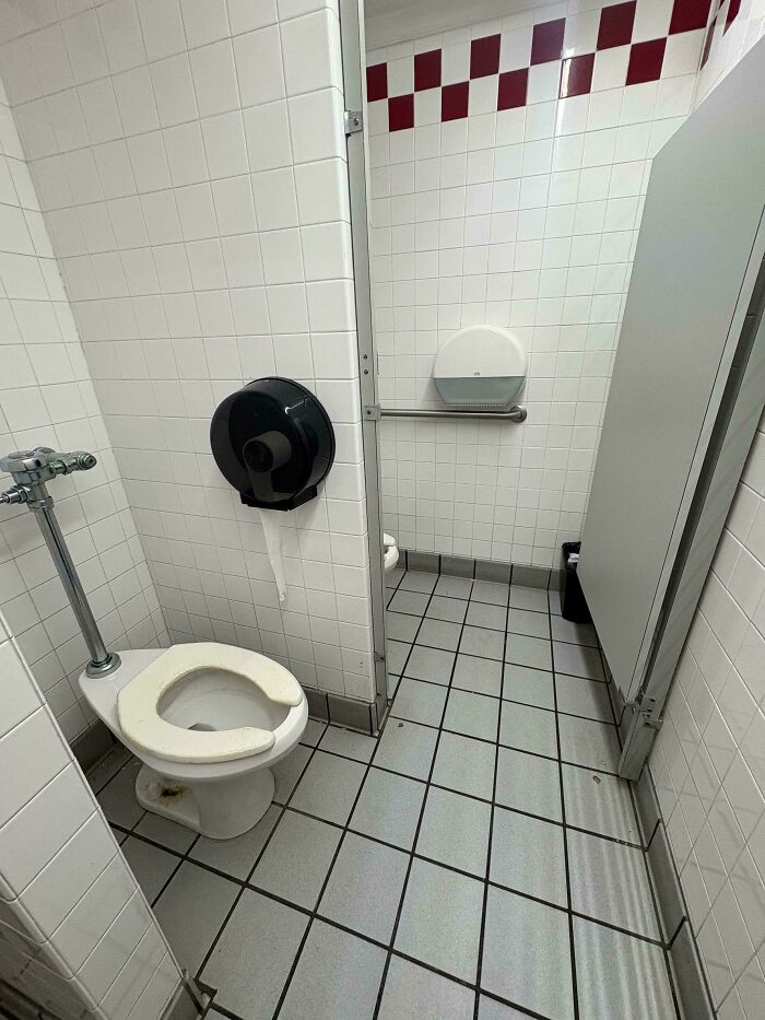
© Photo: effervescenteel
#104 They Could Have Made It So Simple
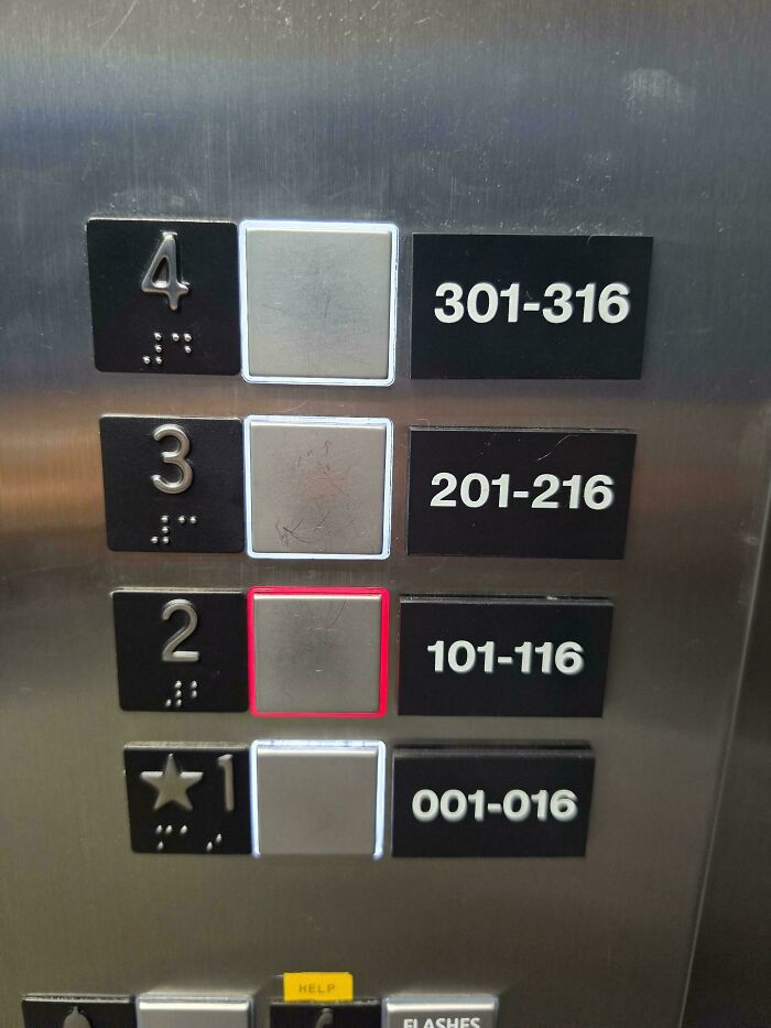
© Photo: slyfox49
#105 Nothing Left? So Goon!

© Photo: bancaletto
#106 Perfectly Camouflaged Door Stopper To Stub Your Toes
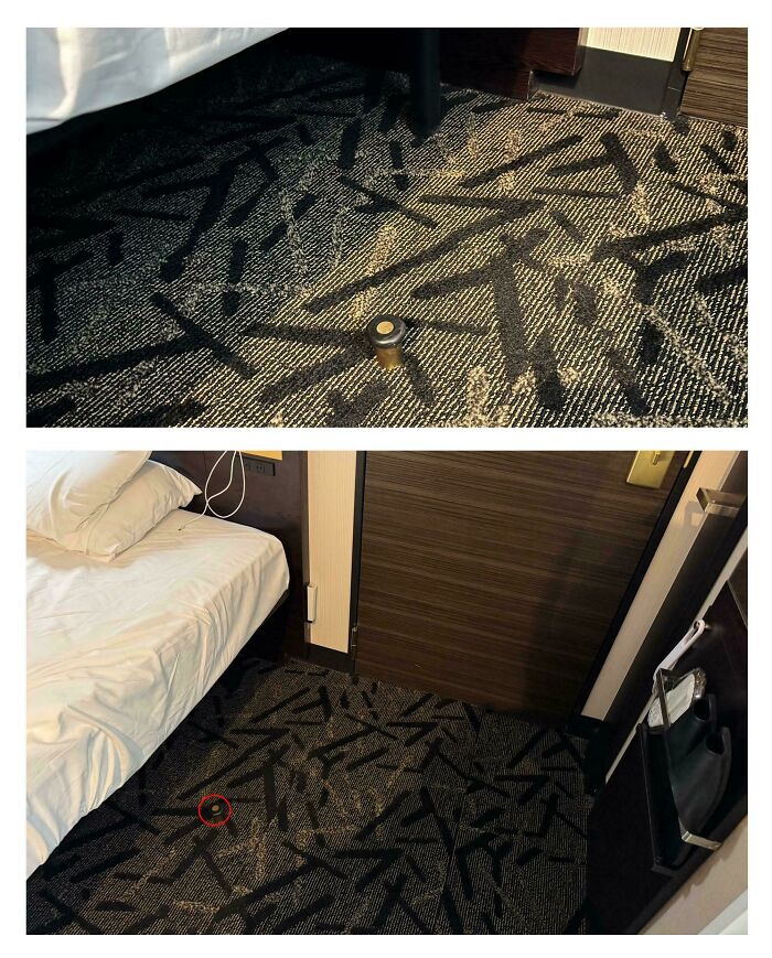
© Photo: wtclover
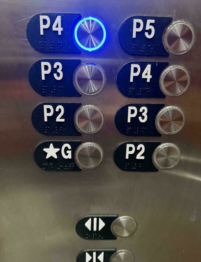
#107 I Don’t Know The Difference?
© Photo: pargonaut
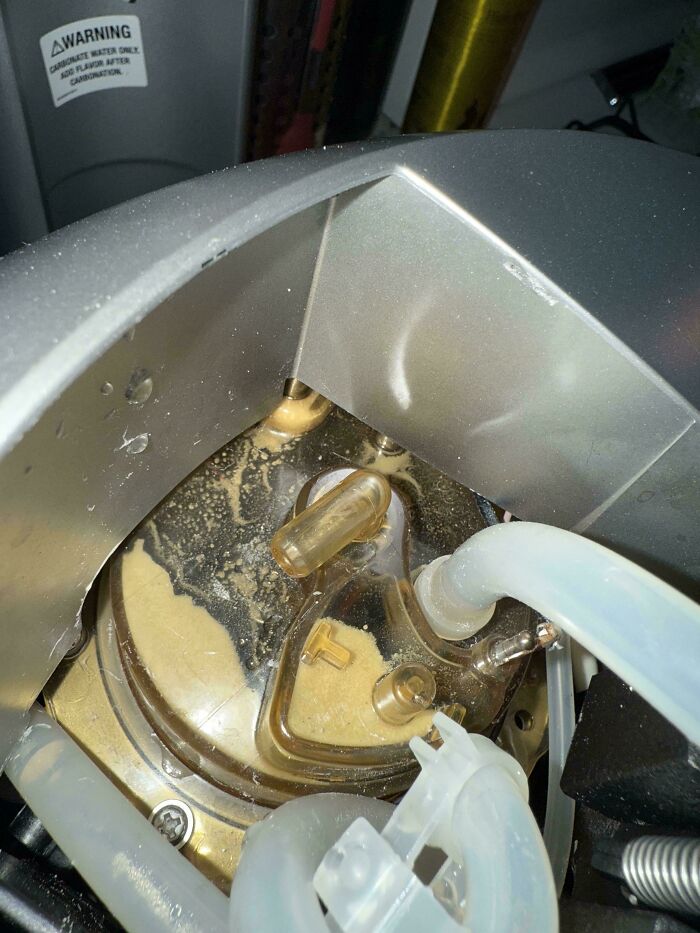
#108 Keurig Made Coffee Machines Impossible To Clean Properly
© Photo: Most_Tackle_3620
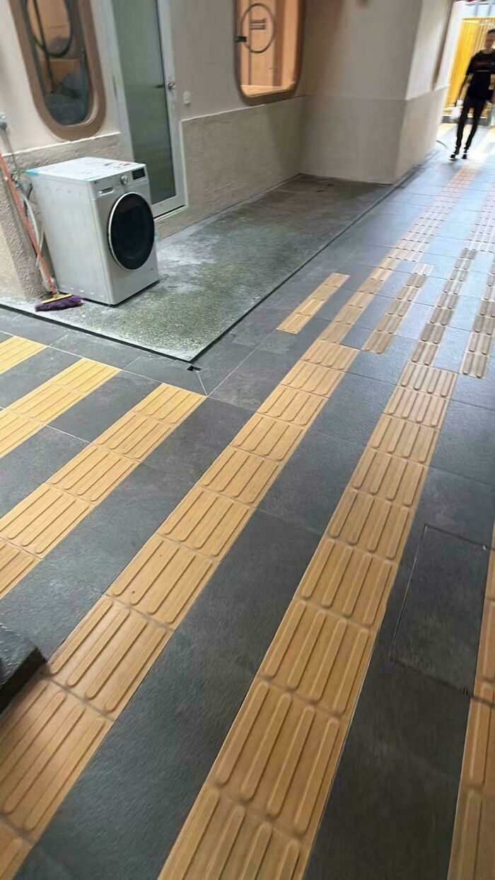
#109 I Don't Think They Know The Purpose Of Directional Block Tactiles
© Photo: I_am_from_2029
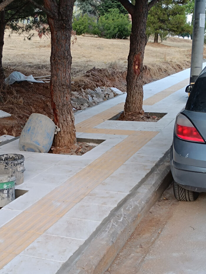
#110 Tactile Paving Obstacle Race
© Photo: BananaramaKing
#111 The Vertical Bunny Rabbit Logo Didn't Fit On The Horizontal Banner So They Just Chopped Off Its Head And Put It On The Ground

© Photo: Captain-Dak-Sparrow
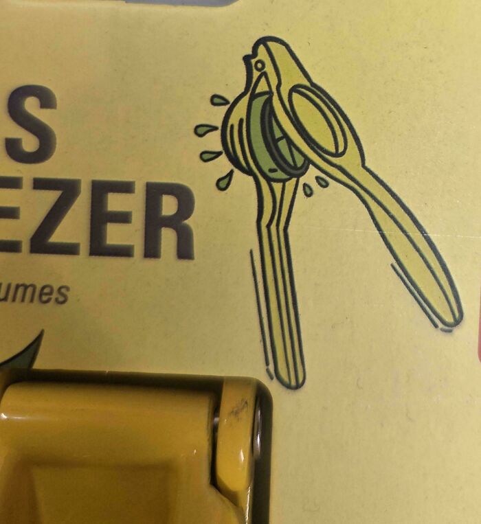
#112 This Lemon Squeezer Packaging Demonstrates How To Use It Incorrectly
© Photo: NorthlightV
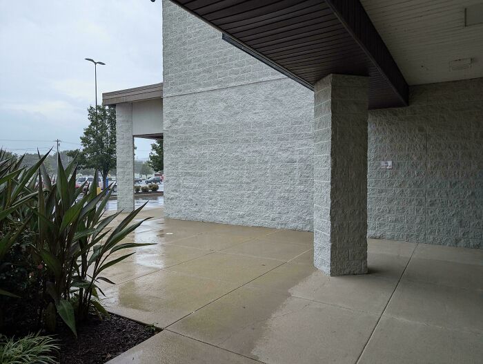
#113 Common Strip Mall Issue. If You Are Going To Provide Protection From The Elements, Why Not Actually Provide Continuous Coverage So That Patrons Can Move Between Businesses Without Getting Wet?
© Photo: FormerPersimmon3602
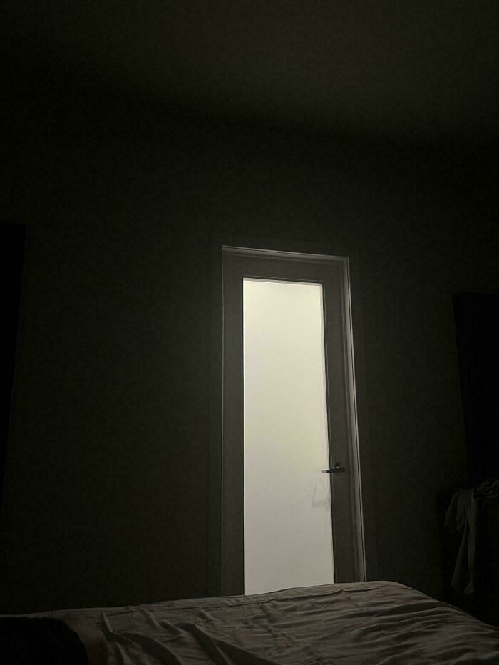
#114 Light From Bathroom At 3am In A Hotel Room. Why Can’t It Be A Solid Door
© Photo: Johnnysins69120
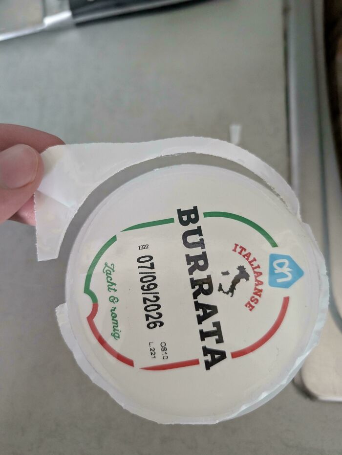
#115 The Plastic Of This Container Lid Is Weaker Than The Bond Between It And The Container Itself
© Photo: jukefishron
#116 These Type Of Stop Buttons On Busses In Gothenburg, Sweden - Can't Tell You How Many Times I've Accidentally Pushed It With My Leg
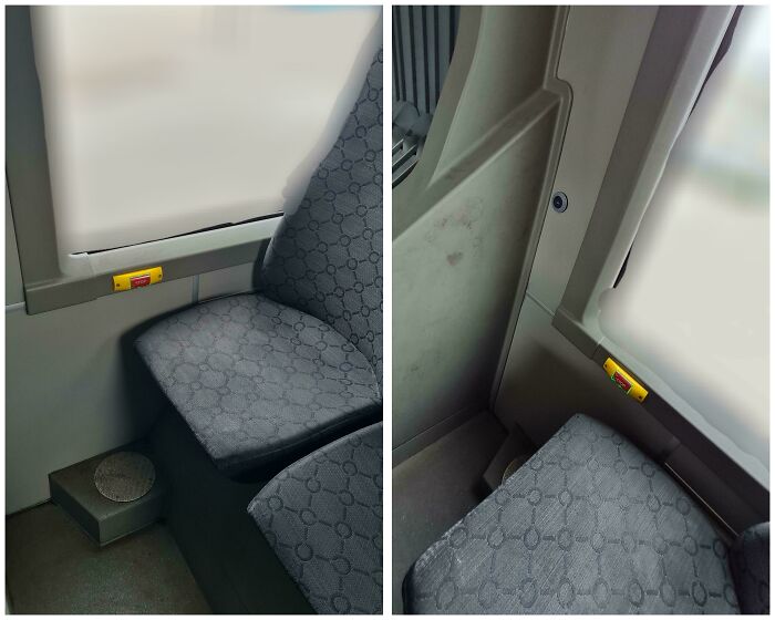
© Photo: Low_Key_Giraffe
#117 This Walmart Has Cart Wheels That Lock When You Cross A Sensor, To Keep People From Stealing Them. They Put The Sensor Inside The Parking Lot So Most Carts Lock Up
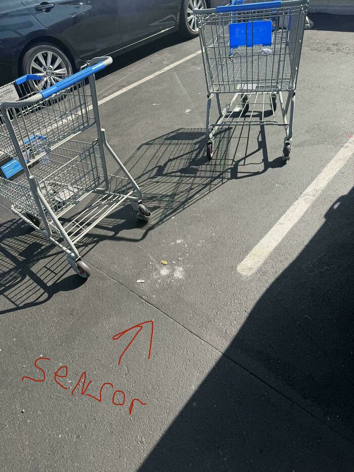
© Photo: devilsbard
#118 Stainless Steel Clothes Drying Rack.. Except The Screws
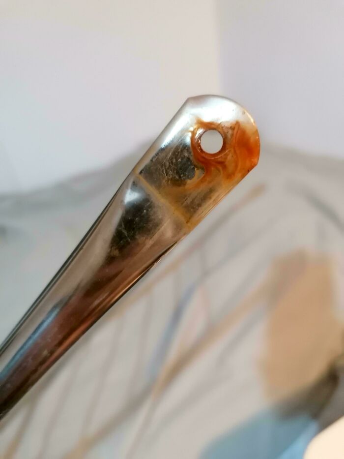
© Photo: eru777
#119 This ATM Is Too Close To The Drive-Through Teller. When The Teller Is In Use You Can’t Get To The ATM Unless You Get Out Of Your Car
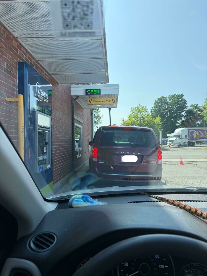
© Photo: leahmd93
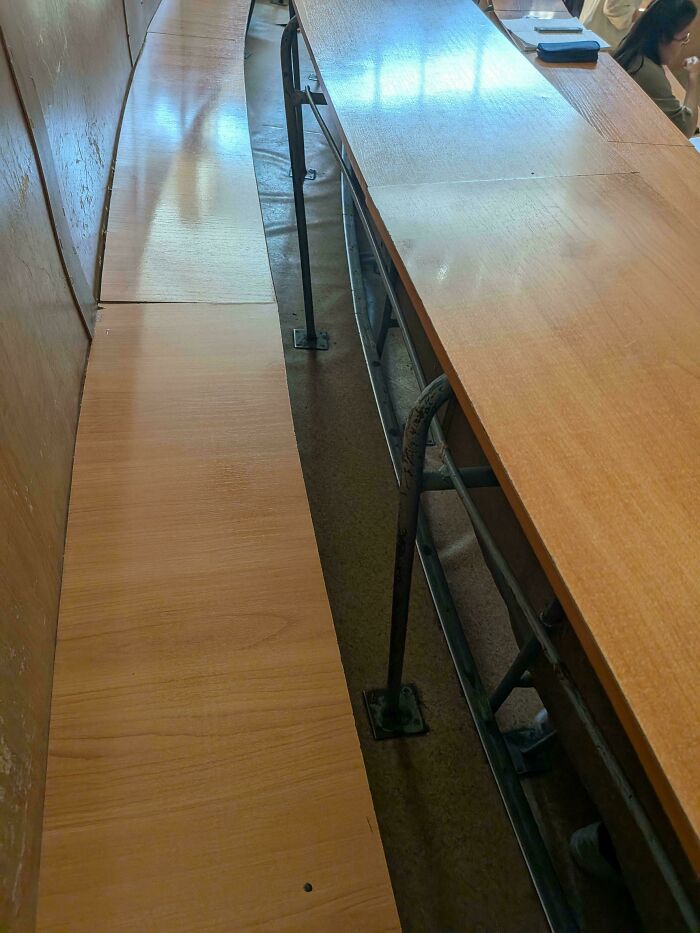
#120 The Gap Between Seat And Rail Is So Narrow, It's Impossible To Pass Through And Sit In The Middle. Same From The Other Side Of The Desk
© Photo: Vidy_Animates
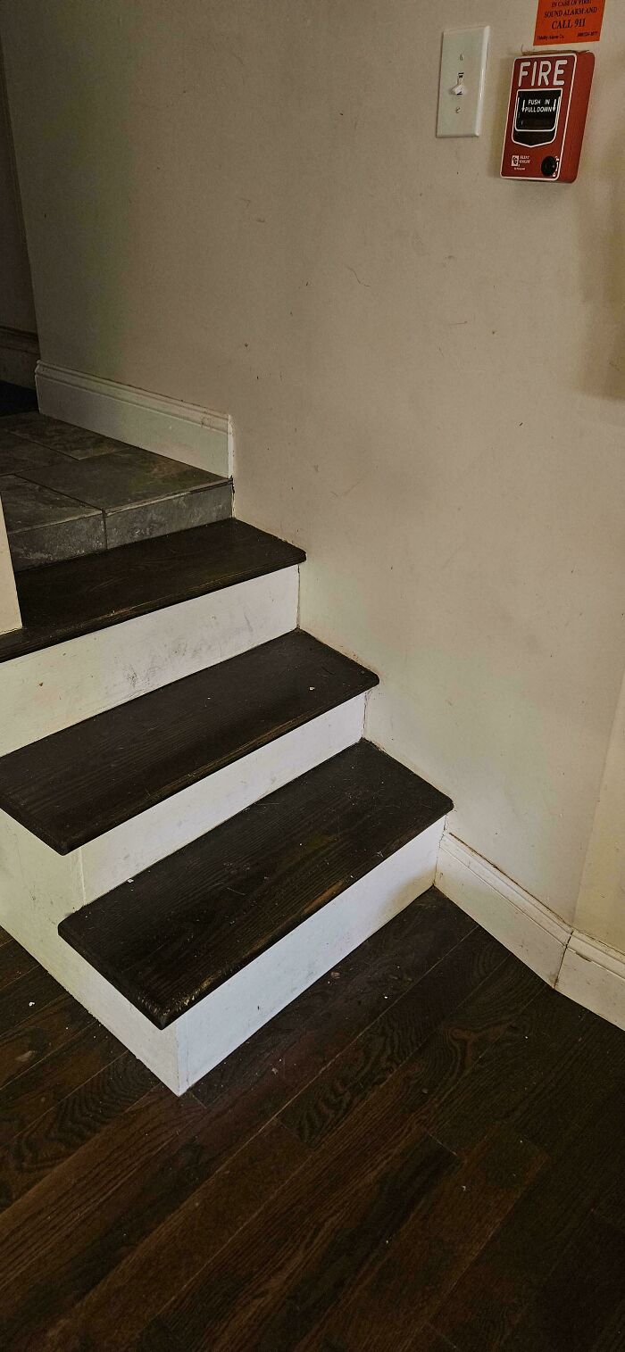
#121 The Stairs To My Bedroom Have A Half Step At The Top
© Photo: AcidicSlimeTrail
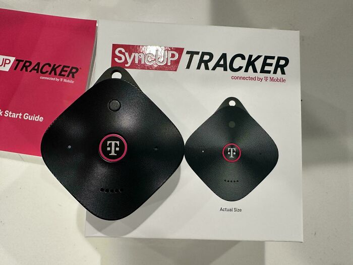
#122 No, It Is Not The Actual Size
© Photo: Senor_Diablo
#123 So That's Where It Comes From

© Photo: ralseiwantsyourip
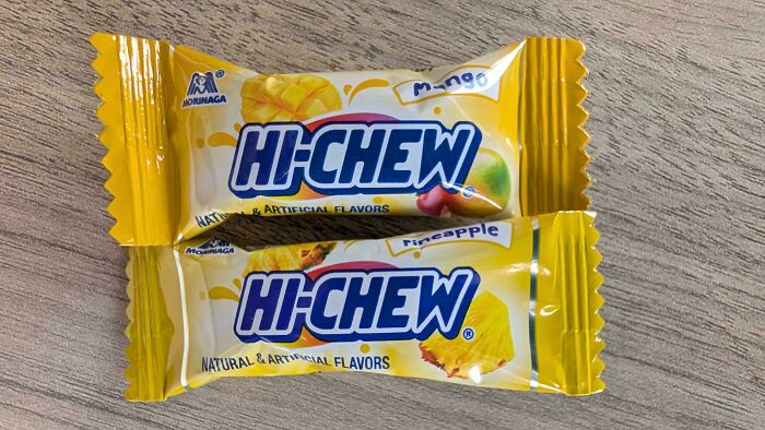
#124 Here Is A Side-By-Side Picture. This Is From Their Tropical Mix Bag. Two Flavors Both Use A Very Close Yellow. It's Bad Design!
© Photo: wiltony
#125 Some People Don't Understand What Those Tiles Are For
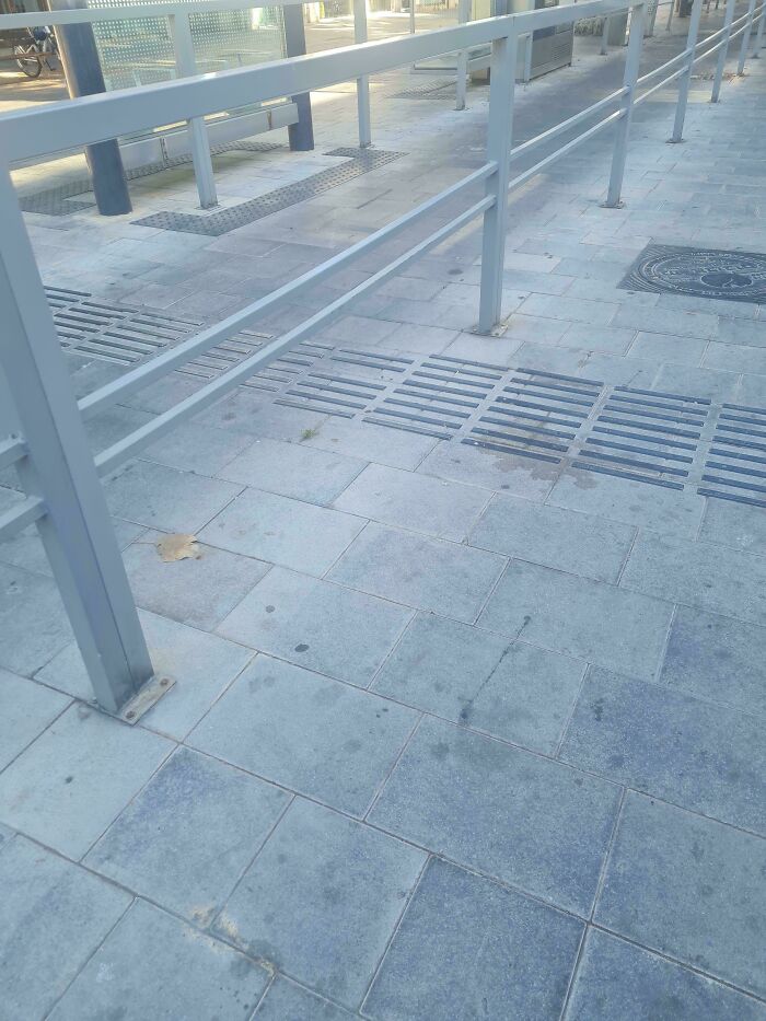
© Photo: i_love_catYY
#126 First Aid Kit Needs To Be Opened Using Two Fingers Of Each Hand
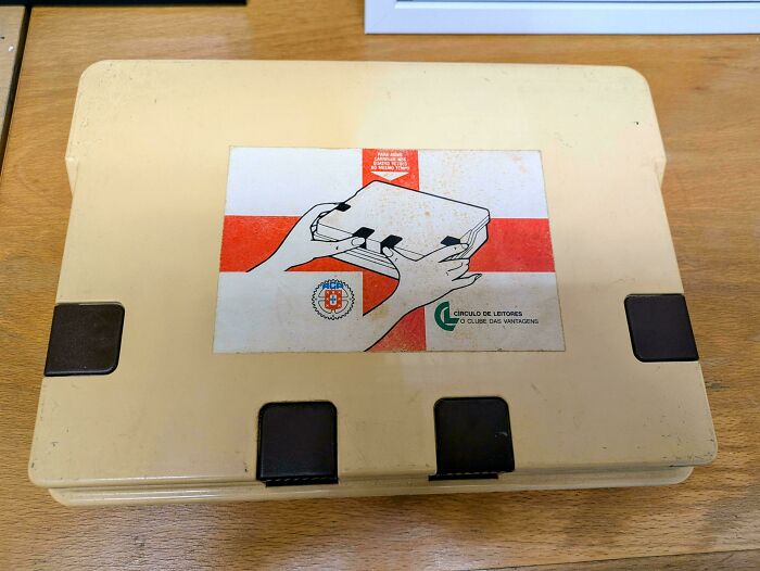
© Photo: EletricoAmarelo
#127 The Word “Choice” And The Look On This Man Seem A Bit Disconnected

© Photo: Best_Entertainment52