
We are in many ways blessed to live in a world big enough that we need maps to remember everything. The downside is that we need maps to get around or just visualize information. And like any medium, it can be done well or very, very poorly.
So if you want to feel lost from behind your screen, we’ve gathered some of the best posts from a group dedicated to sharing the worst maps folks have ever seen. Get comfortable as you prepare to furrow your brow in confusion, upvote your favorites and be sure to share your thoughts in the comments section down below.
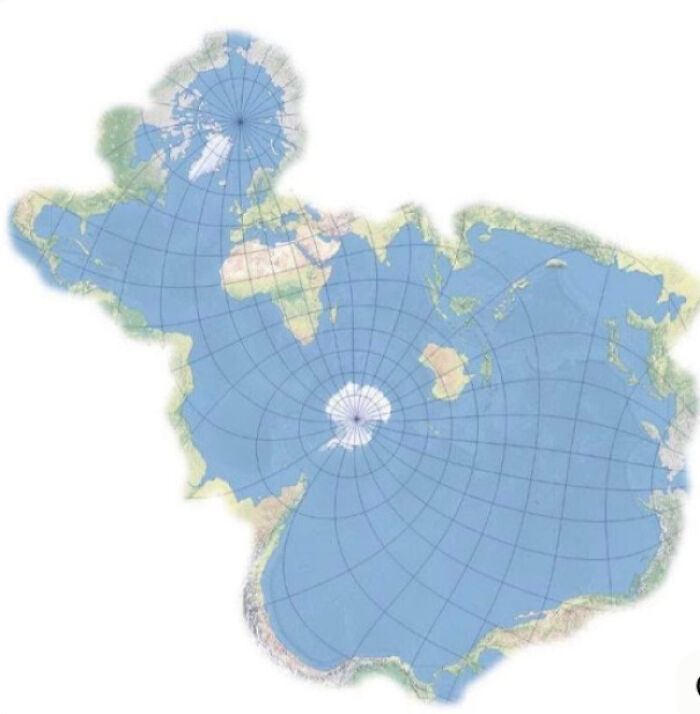
#1 World Map According To Fish
© Photo: Pinkplatabys
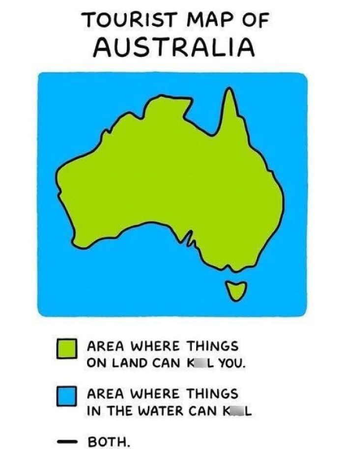
#2 They Didn't Need To Make The Legend This Honest
© Photo: HelicopterEmpty7393
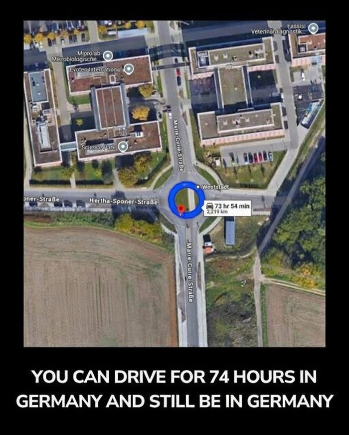
#3 Did You Know, You Can Drive For 74 Hours In Germany And Still Be In Germany?
© Photo: Immediate_Wallaby107
A map is really just an answer to a question, and the question is usually some version of how to get from here to there without losing your sanity. The best maps know exactly which question they are answering and politely ignore everything else. The worst ones try to answer every question at once, or better yet, a question nobody asked. That one idea separates a map you can use from a map you can only hang in the hallway as a conversation piece.
The London Underground map is a masterclass in knowing what to leave out. Before the 1930s the network was drawn over real London geography, which meant tangled curves and cramped central stations.
#4 Not Sure If Terribly Accurate Or Just Terrible
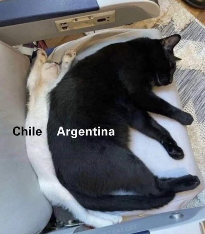
© Photo: LadySpud
#5 Map Of European Countries Playing Football
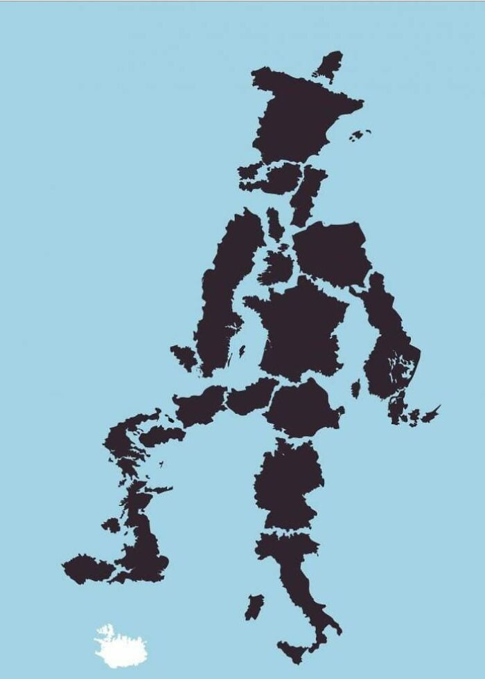
© Photo: EngroveGMD
#6 Proposal To Place Chile Between Canada And USA
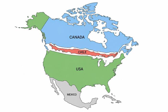
© Photo: jamexfot
Then a draftsman named Harry Beck, who spent his days sketching electrical circuit diagrams, decided to treat the whole system like a circuit board. His version showed how stations connect rather than how far apart they really are, and the London Transport Museum notes that a 2006 national contest ranked it the second favorite British design of the twentieth century. It is not flawless, since plenty of people have hopped on a train between two stations that are a short stroll apart because the map made the gap look huge. Still, for deciding which line to take and where to change, it is very hard to beat.
#7 Sri Lankan Map Of The USA
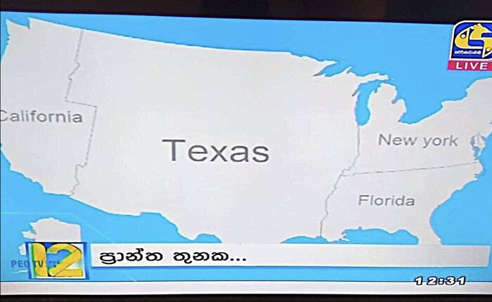
© Photo: SingularSeal
#8 How I See Europe As A Color Blind Person
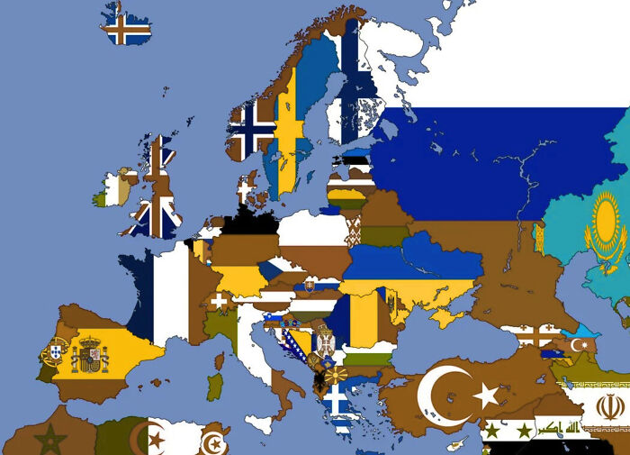
© Photo: Many_Ad_7536
#9 My Try To Draw The World By Memory
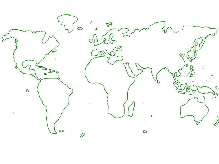
© Photo: Tasty_Throat2082
Then come the humble extras that separate a real map from a doodle. A legend explains the symbols, because a tiny blue triangle could be a campsite, a lighthouse, or a sandwich shop. A scale tells you whether that squiggle is a ten minute stroll or a three day expedition. A north arrow stops you from marching confidently the wrong way. A date matters too, since a map showing a bridge that vanished decades ago is less a guide and more a ghost story. And a title helps, because a map that never says what it shows is just expensive wallpaper.
#10 Americans Visit Europe Like
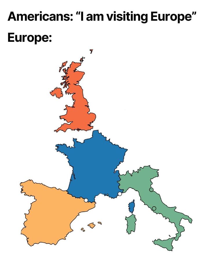
© Photo: Jacob-Anders
#11 What's Wrong With Poland?
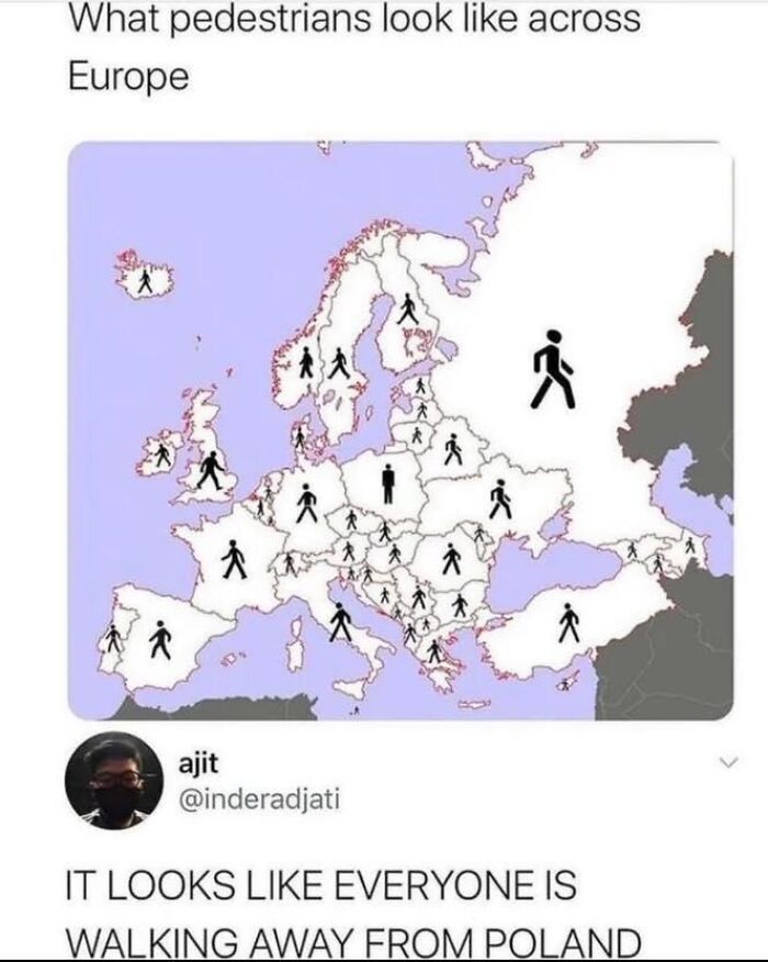
© Photo: KaleidoscopeFast7871
#12 You Can Sail From Georgia To Georgia In A Perfectly Straight Line
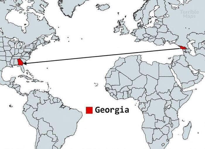
© Photo: Over-Professor6495
Every flat map of a round planet has to bend the truth somewhere. The famous Mercator projection is a gift to sailors because a straight line on it matches a steady compass heading. The price is that it stretches places near the poles and shrinks places near the equator, so Greenland looks almost as big as Africa, even though Africa is roughly fourteen times larger.
#13 How I See Europe As A Non-European
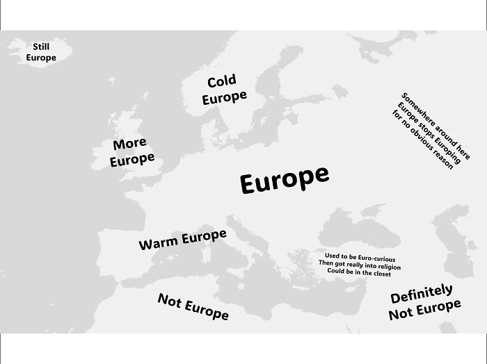
© Photo: Certain-Appeal-6277
#14 How I See USA As An European
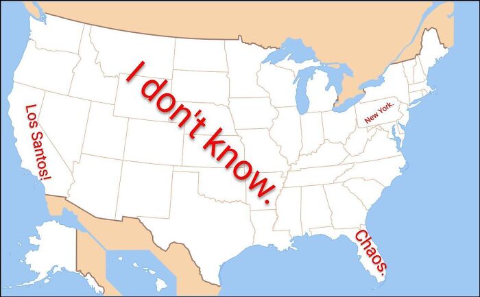
© Photo: Super-Tonight-7106
#15 Does Your Country Lie Mostly North Or South Of The Equator?
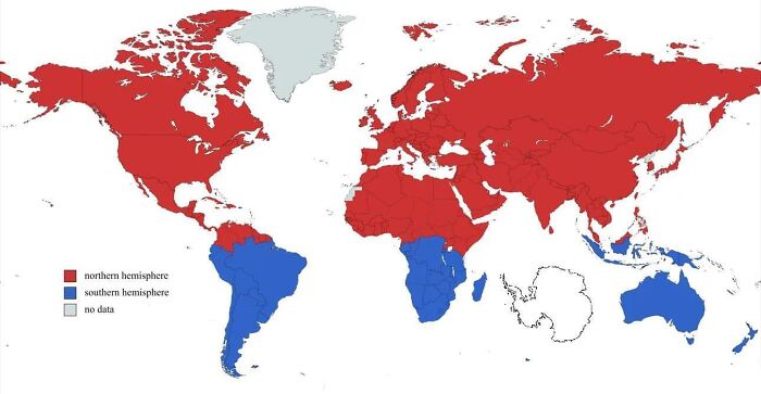
© Photo: CinemaslaveJoe
You can drag countries around and watch them change size on The True Size Of, which is a lovely way to lose an afternoon. A projection is not good or bad by itself. It is only good or bad for a job, and a map built for ships is the wrong tool for settling arguments about which country is biggest.
#16 If You Put The Us & Canada Over Europe, A Lot Of People Would Lose Their Lives
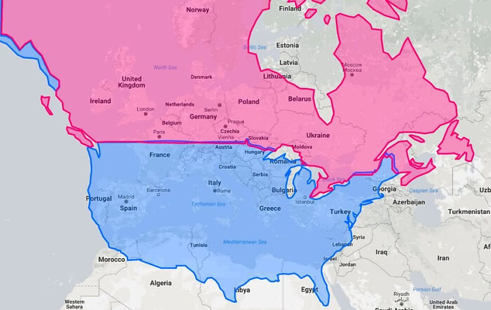
© Photo: EngroveGMD
#17 England's Worst County - End Results
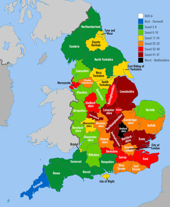
© Photo: TheEnlight
#18 Merch Shipping In Pangea
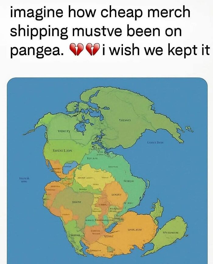
© Photo: GossipBottom
A map with the right information can still flop if nobody can read it. Colors that are too similar, labels piled up like passengers on a rush hour train, and text so tiny it needs a magnifying glass all make a map miserable. So does using red and green as the only difference between two things, which leaves some readers guessing. Good design is mostly contrast and breathing room, so the eye knows where to land first.
#19 Indeed Terrible
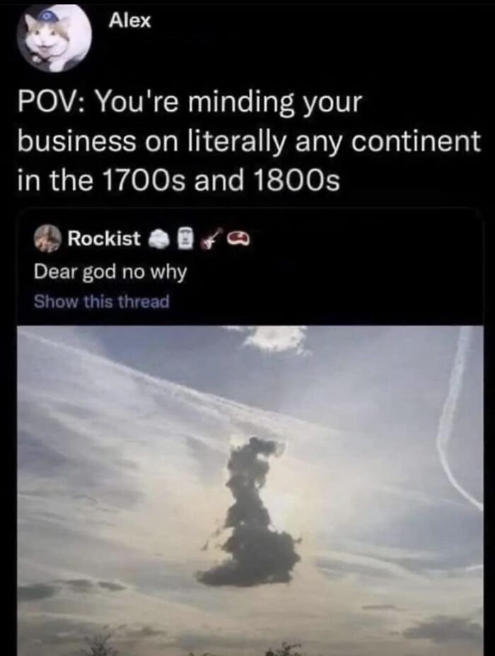
© Photo: GossipBottom
#20 Seems Legit
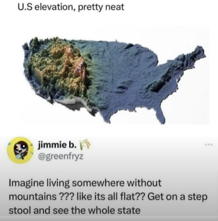
© Photo: StMungo-ofCincinnati
#21 I Love My Country
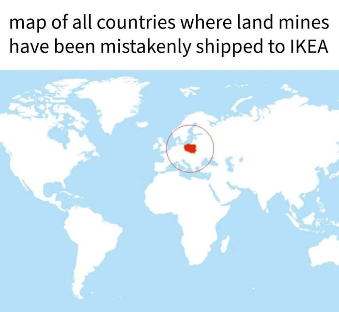
© Photo: dhevxxx
Sometimes a map is not for finding your way at all but for finding an answer. During a cholera outbreak in Soho in 1854, physician John Snow marked the cases on a street map, and the lethal cases clustered around one water pump on Broad Street. The London Museum explains how Snow used it to persuade local authorities to remove the pump handle. The map worked because it showed two things clearly, the lethal cases and the pumps, and let everything else sit quietly in the background.
#22 Railway Map Of Antarctica
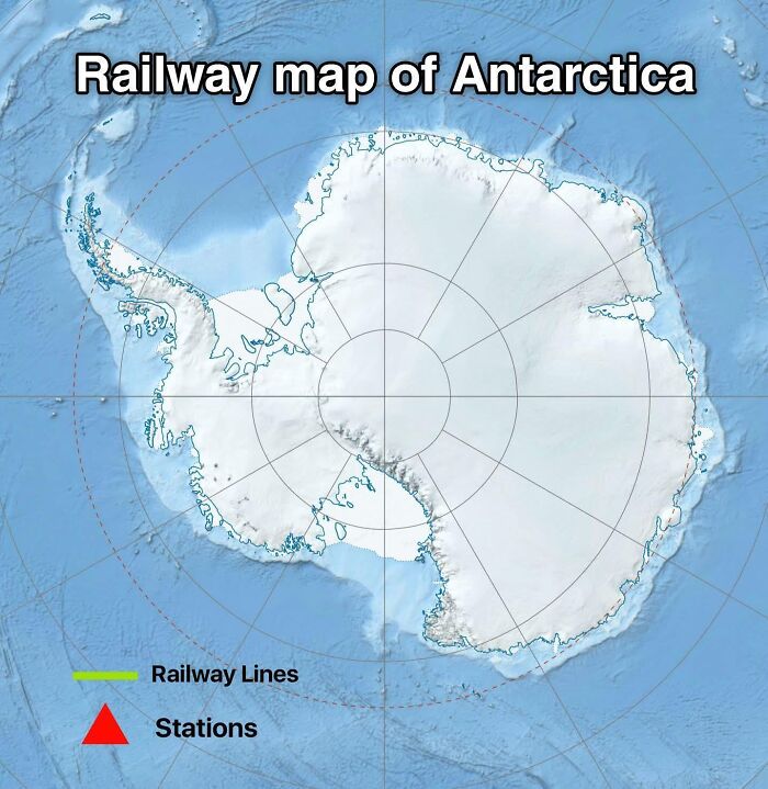
© Photo: honeybeesuke
#23 Us States With At Least 3 Trees
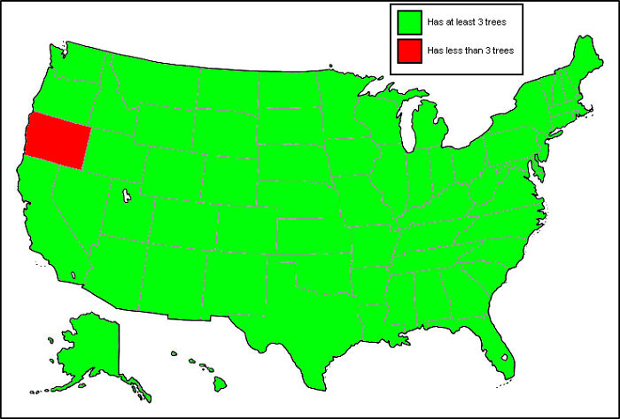
© Photo: DiggyPT_69
#24 Chances Of Being Born In Each Continent
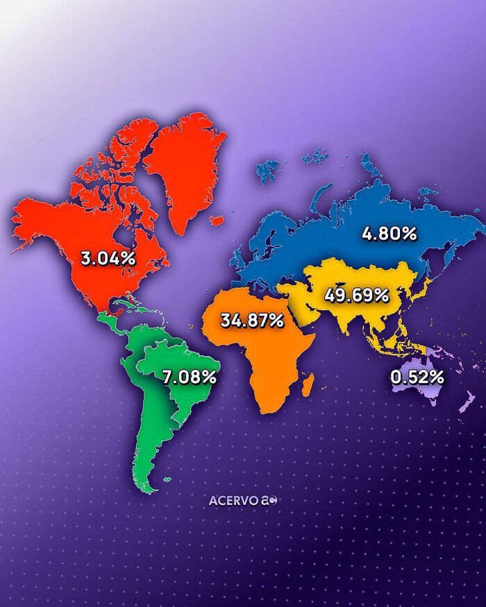
© Photo: PositionExpensive575
#25 What If The Economies Of Albania And China Were Combined?
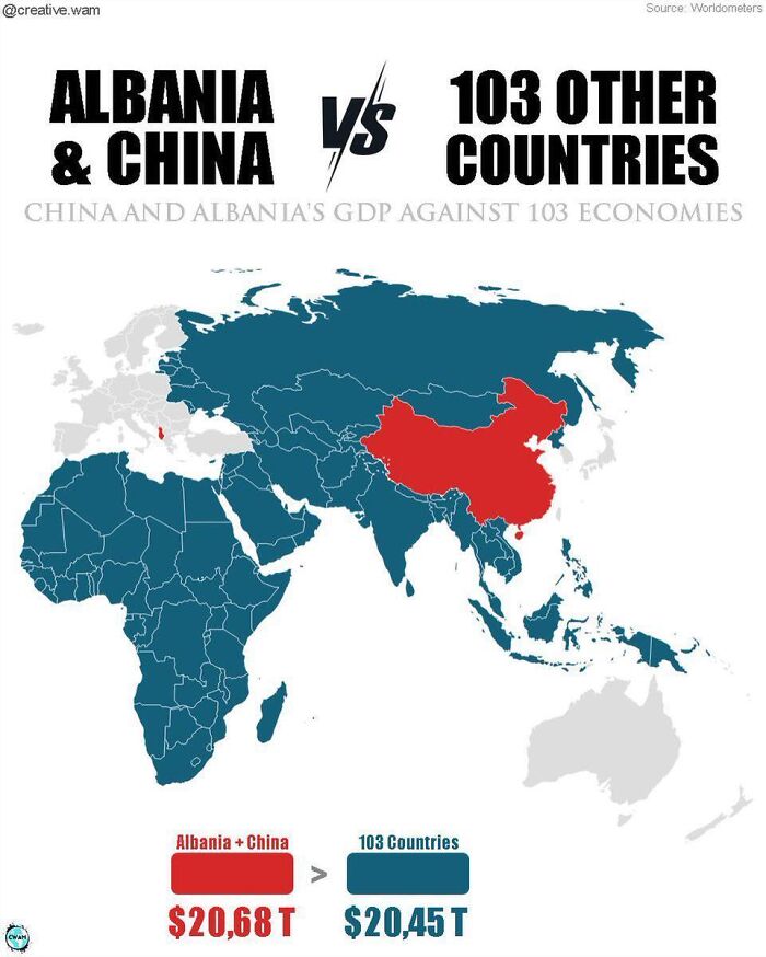
© Photo: Sharrysama
#26 How Americans See Europe
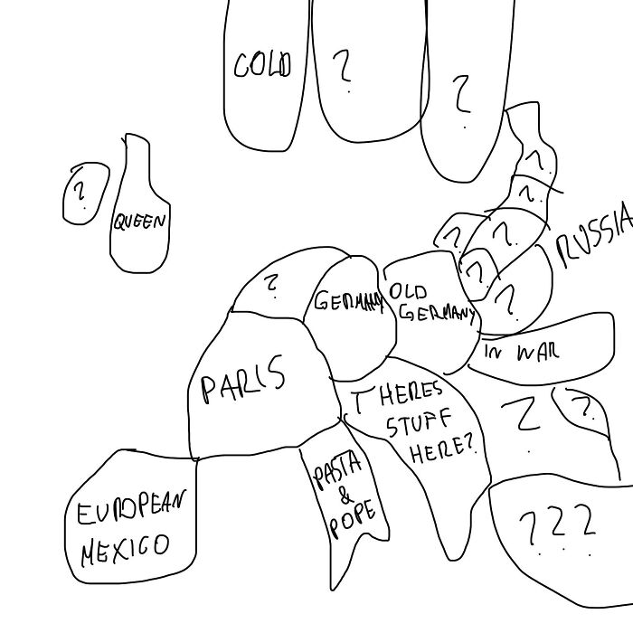
© Photo: nocalniko
#27 America Explained
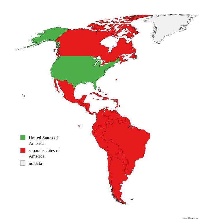
© Photo: RattusCallidus
Then there is the opposite approach, which is packing in a huge amount and somehow pulling it off. In 1869 the French engineer Charles Minard drew Napoleon's disastrous march into Russia as a single image, with a band that thins as soldiers are lost and a temperature line for the freezing retreat. Big Think's Strange Maps column points out that it unites six different sets of data, and it still reads easily because every piece serves one story. Crowding is fine as long as the crowd has a job.
#28 Map Of European Countries Based On How Gay They Are
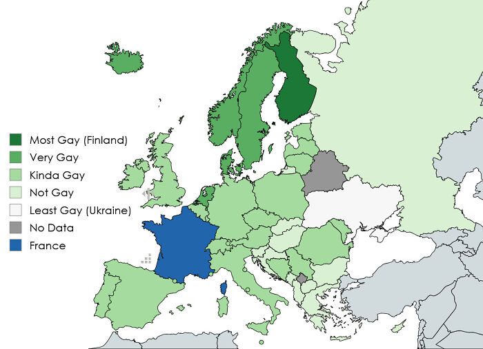
© Photo: strangetoaster167
#29 What???

© Photo: Ollieboy458
#30 Remove The Worse Half Of The Map - Round 9
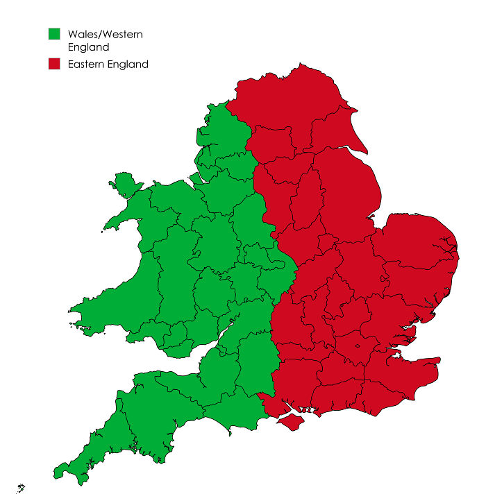
© Photo: Auditored
So a useful map answers a clear question, leaves out what does not matter, labels what remains, admits its limits, and never makes the reader squint. Keep that in mind as you scroll, because the maps ahead miss nearly all of it, and a few of them seem to be doing it on purpose.
#31 Map Of Europe But Its Color Depends On A Coin Toss
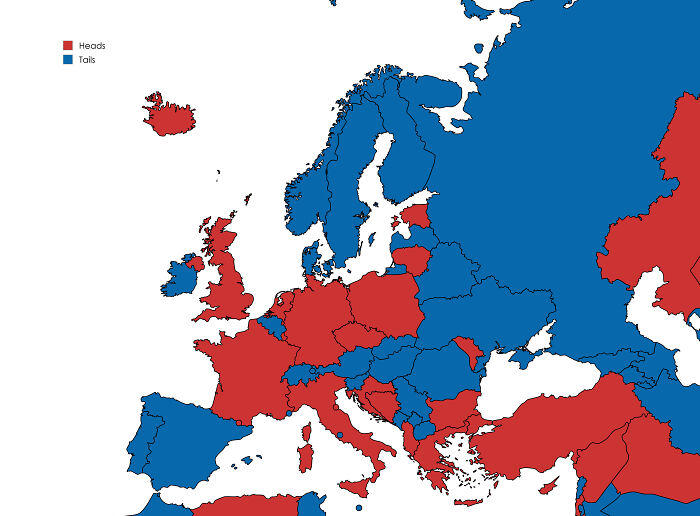
© Photo: akkstatistician
#32 Mind Blown
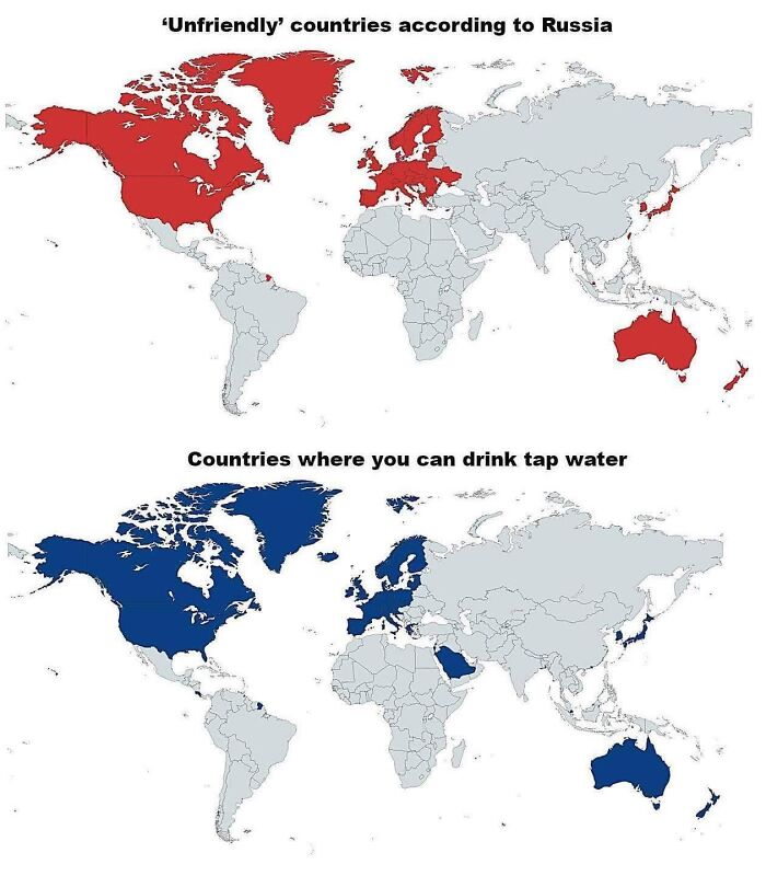
© Photo: CinemaslaveJoe
#33 If The UK Was Next To Japan
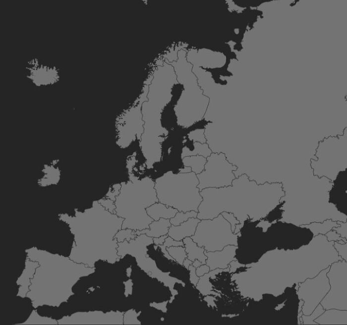
© Photo: NorVideo_1
#34 Took Me A Second To Realize What I Was Actually Looking At
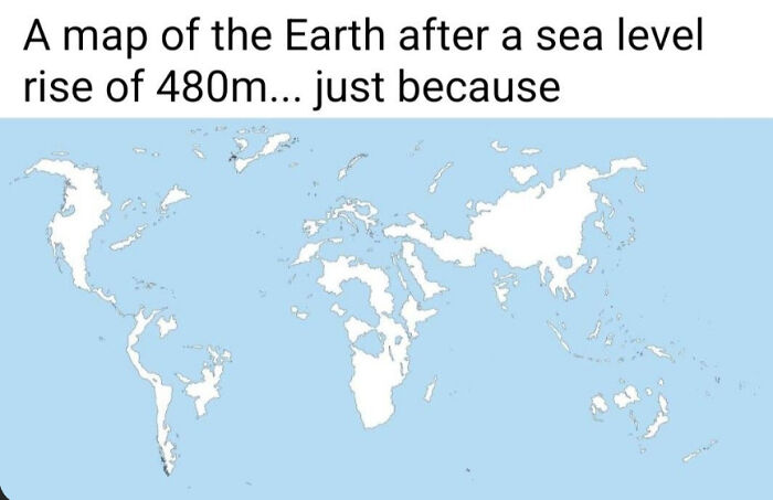
© Photo: Mundane-Temporary426
#35 Remove The Worse Half Of The Map - Round 5
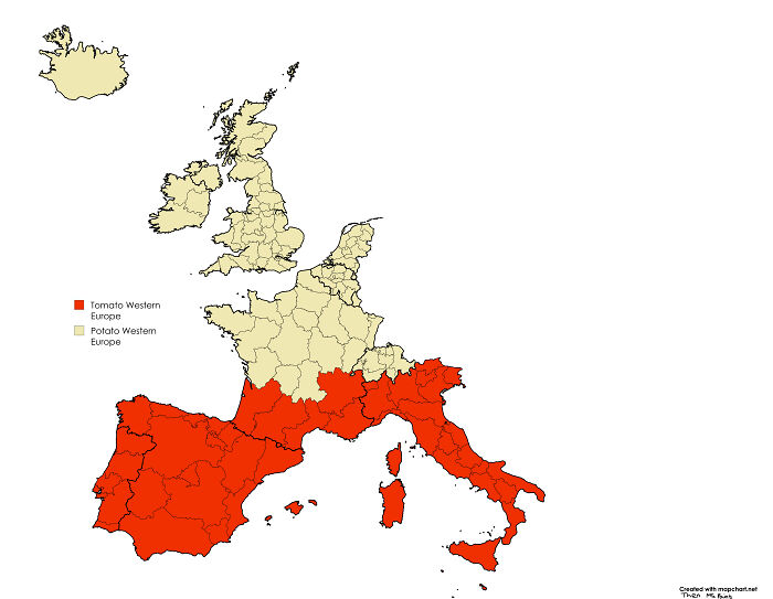
© Photo: Auditored
#36 Countries That Existed 300 Trillion Years Ago
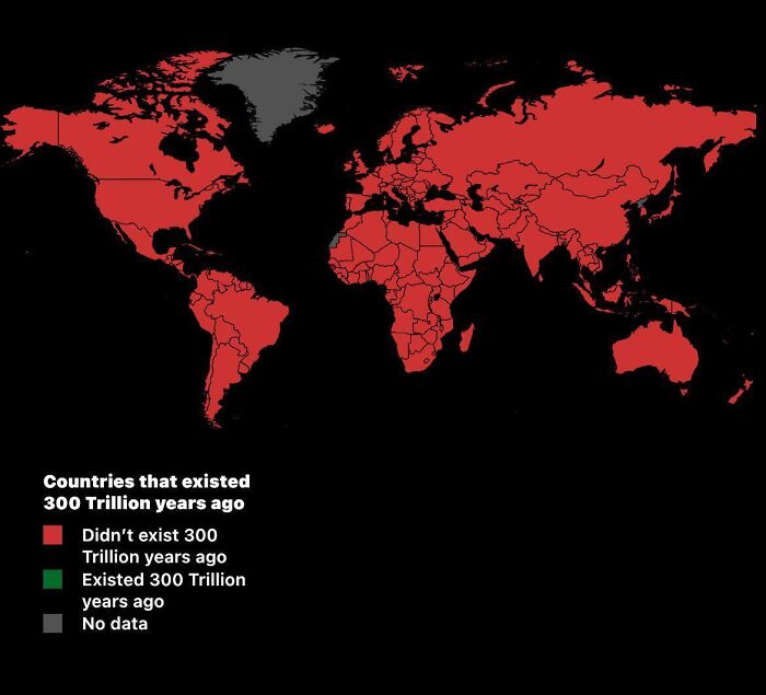
© Photo: Moist-Complaint-7578
#37 An Abomination Quite Frankly
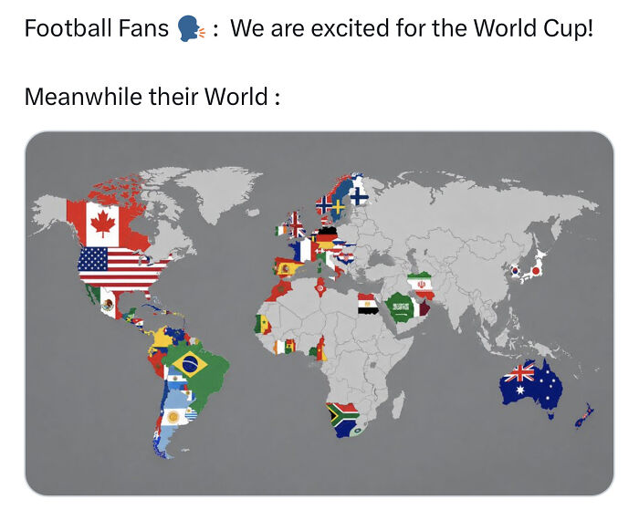
© Photo: Aggressive-Pea-4495
#38 Countries
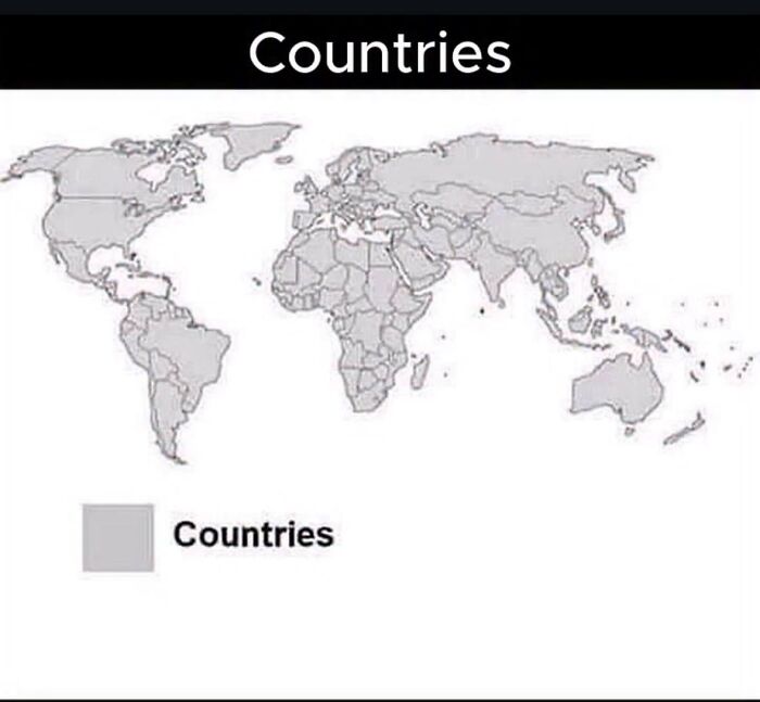
© Photo: Glittering_Truck_655
#39 Shampoo Usage Across Europe
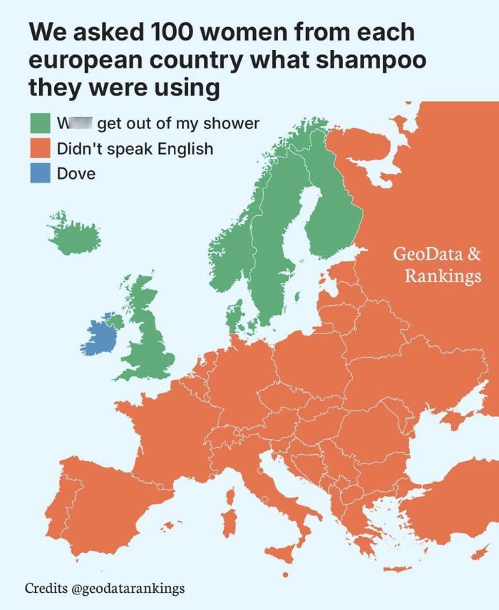
© Photo: Orginal_Copy_WS
#40 How Europeans See The Map
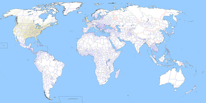
© Photo: Jeremy0207
#41 Countries That I Colored Red
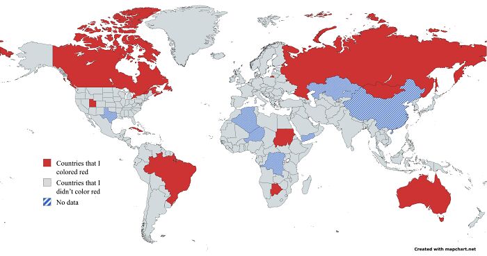
© Photo: Interesting-Bass9957
#42 South America Can Fit All These Countries Inside Itself
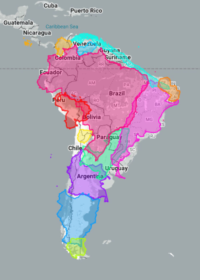
© Photo: Tepp1s
#43 How I See Europe As A Deaf Person
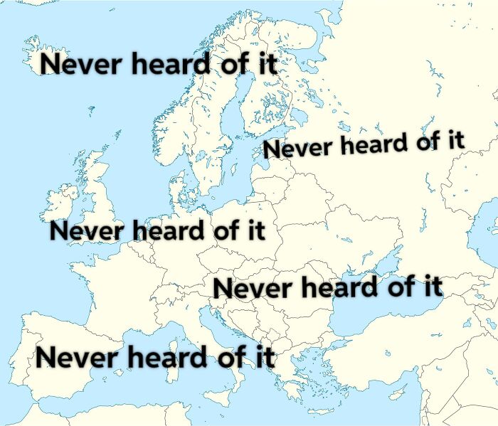
© Photo: LetRevolutionary271
#44 Europe If Red Never Existed
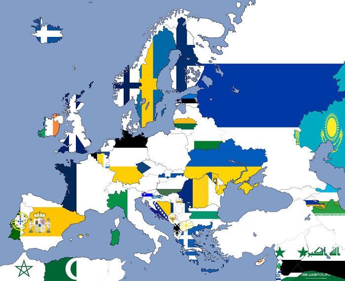
© Photo: Sea_Bobcat695
#45 I Dunno If This Has Been Posted Here Yet
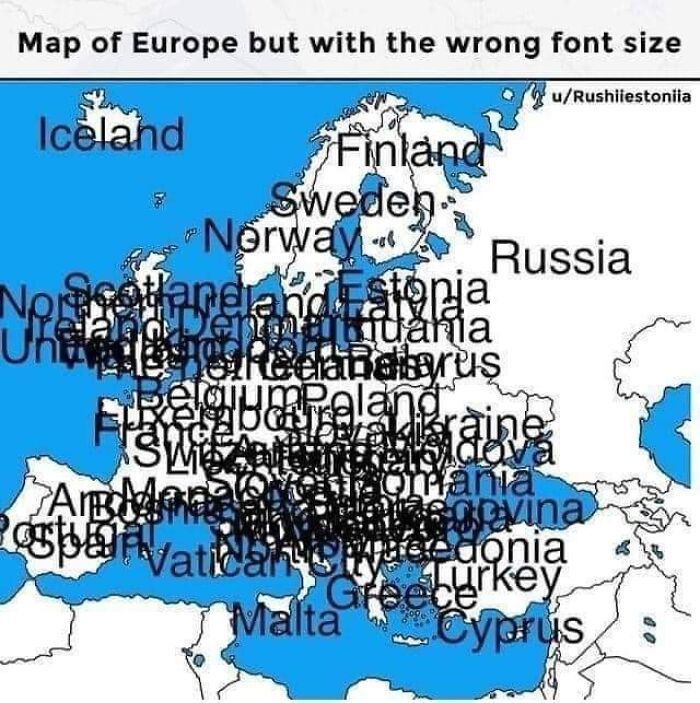
© Photo: kakay2u
#46 Travelling To The USA, What State Should I Go To?
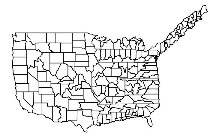
© Photo: DiggyPT_69
#47 For The Rest Of Your Life You Can Only Eat Food From One Of These Regions. Which Do You Choose?
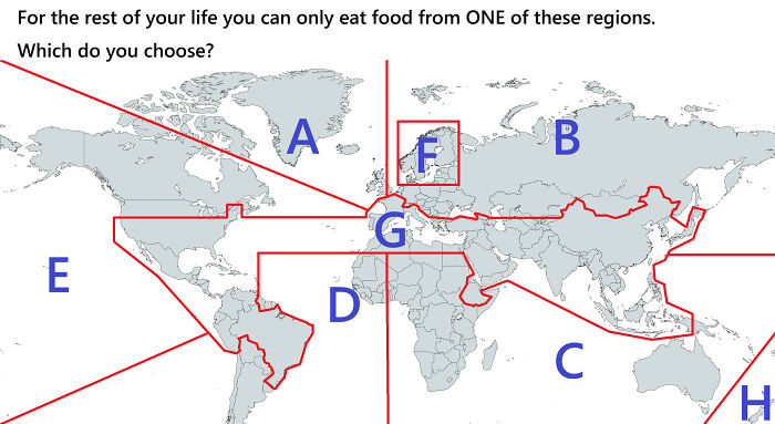
© Photo: Rusiano
#48 Did You Know?
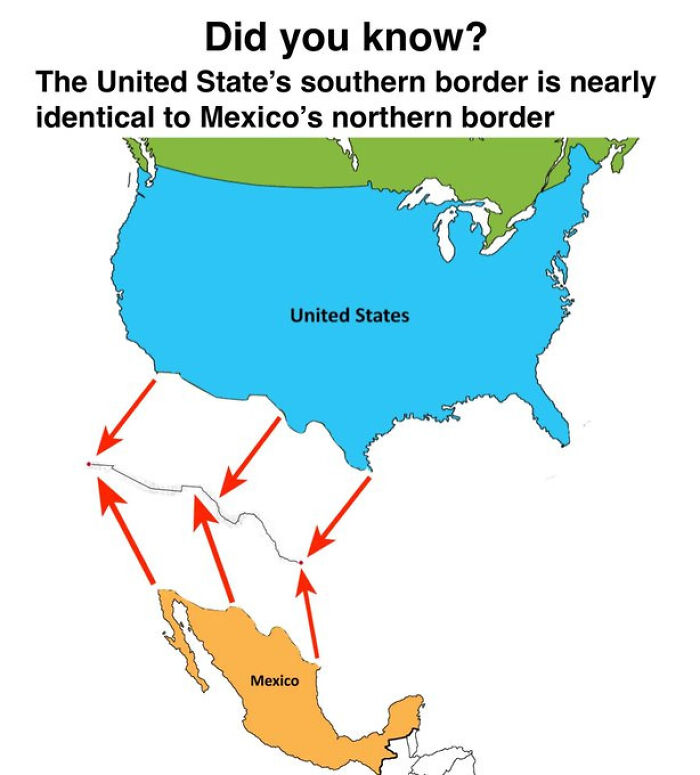
© Photo: EngroveGMD
#49 I Think This Qualifies As A Terrible Map
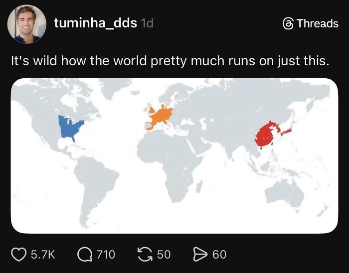
© Photo: ciityofstars_
#50 Country Where A Girl Who Rejected Me Today Is From
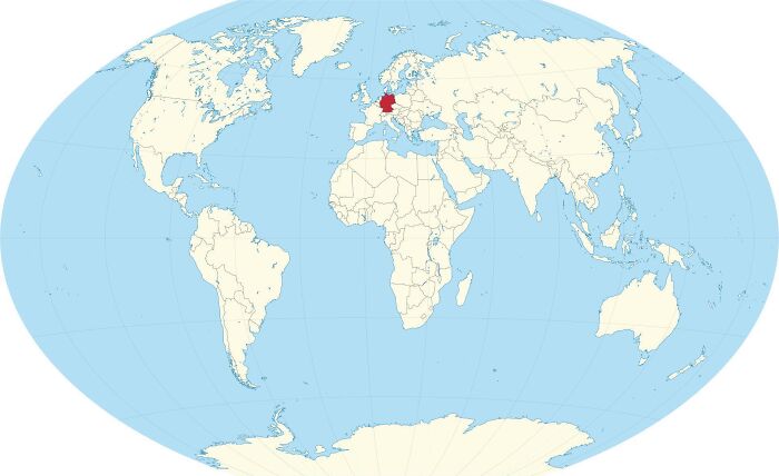
© Photo: AlePiga
#51 If We Could Just Raise Sea Levels By 150 Meters We Get A Backup Strait Of Hormuz
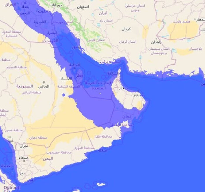
© Photo: Immediate_Wallaby107
#52 Seems Legit
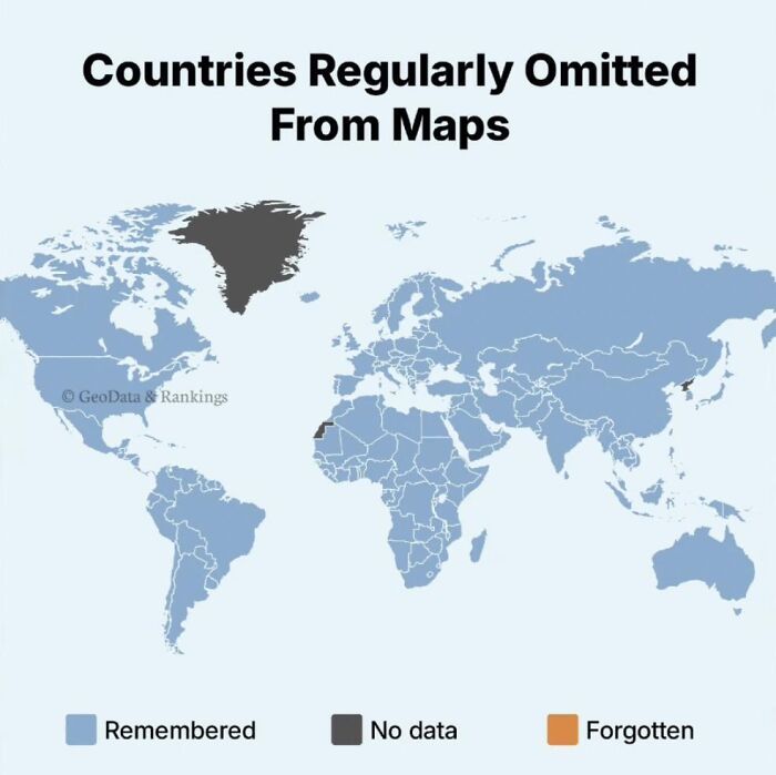
© Photo: PizzaToastieGuy
#53 Un Votes To Illegalize Child Marriage
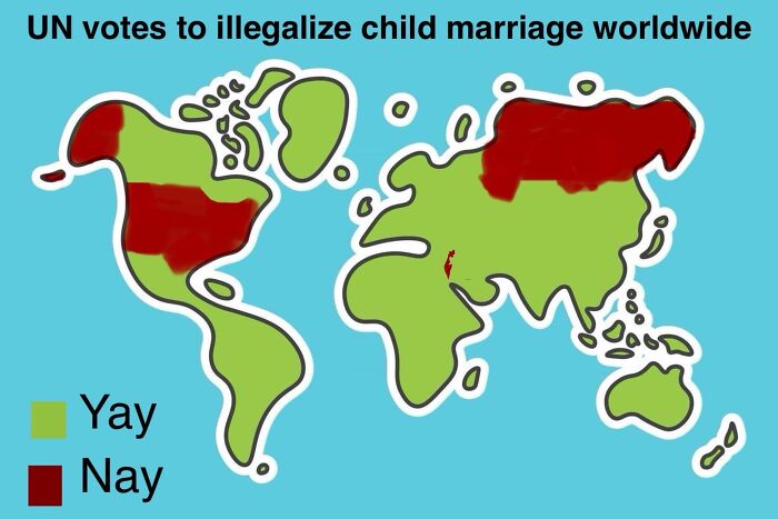
© Photo: Veritas-Cuervo
#54 This Is How I See Europe As A Myanmarese Immigrant Living In Sudan
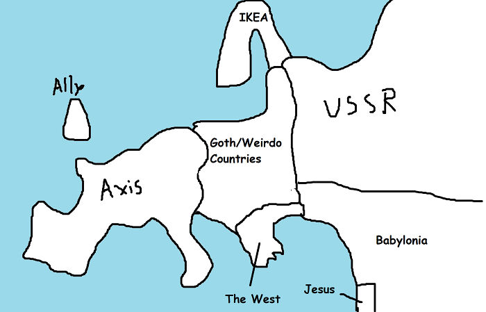
© Photo: Embarrassed_Seat_609
#55 Countries That Don’t Recognize North Korea
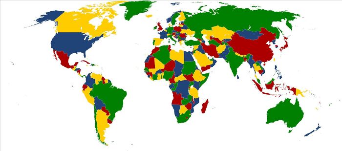
© Photo: NoobieHatPlayz
#56 Europe But I Translated Every Country Name 50 Times
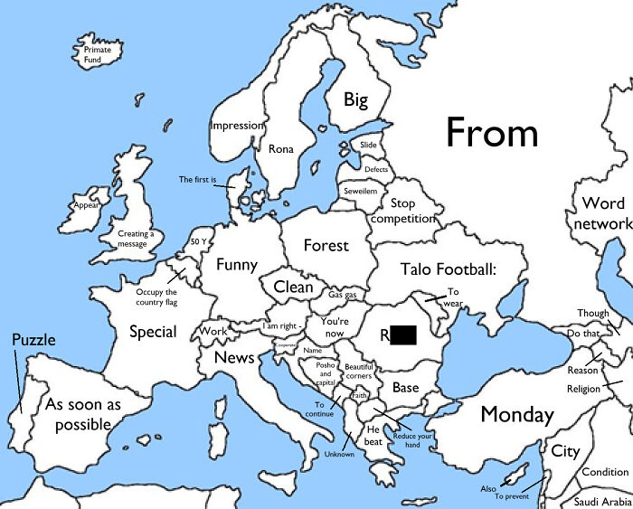
© Photo: mario_kart_player
#57 Does Your Country Have Over 8000000000 People?
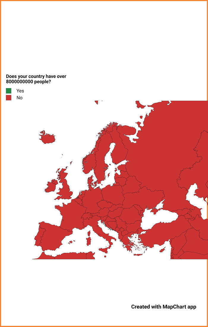
© Photo: Past_Round6702
#58 Worst Country In The Americas - Results
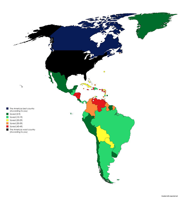
© Photo: THMeijer
#59 America's Worst Fear
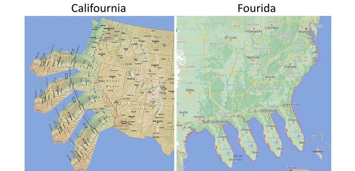
© Photo: pillowman011
#60 The Pacific Ocean Is So Vast It Could Hold 16 Polands
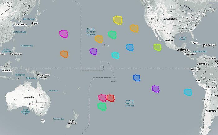
© Photo: Equivalent-Style-260
#61 Saw On Twitter:whites:it Depends:not White
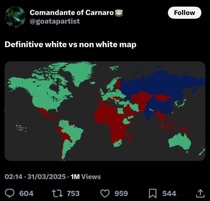
© Photo: PepegaNaMBatChest
#62 Terrible Map In A Coffee Shop In Amman, Jordan
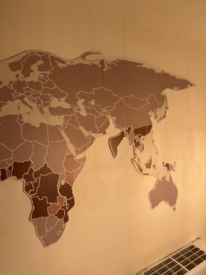
© Photo: bensgroi
#63 How I See Mars As A Plutonian Immigrant
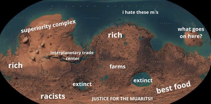
© Photo: aquisoueu
#64 Remove The Worse Half Of The Map - Round 12
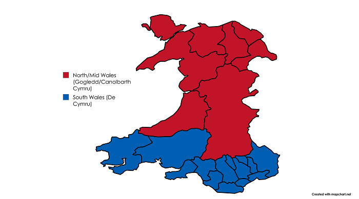
© Photo: Auditored